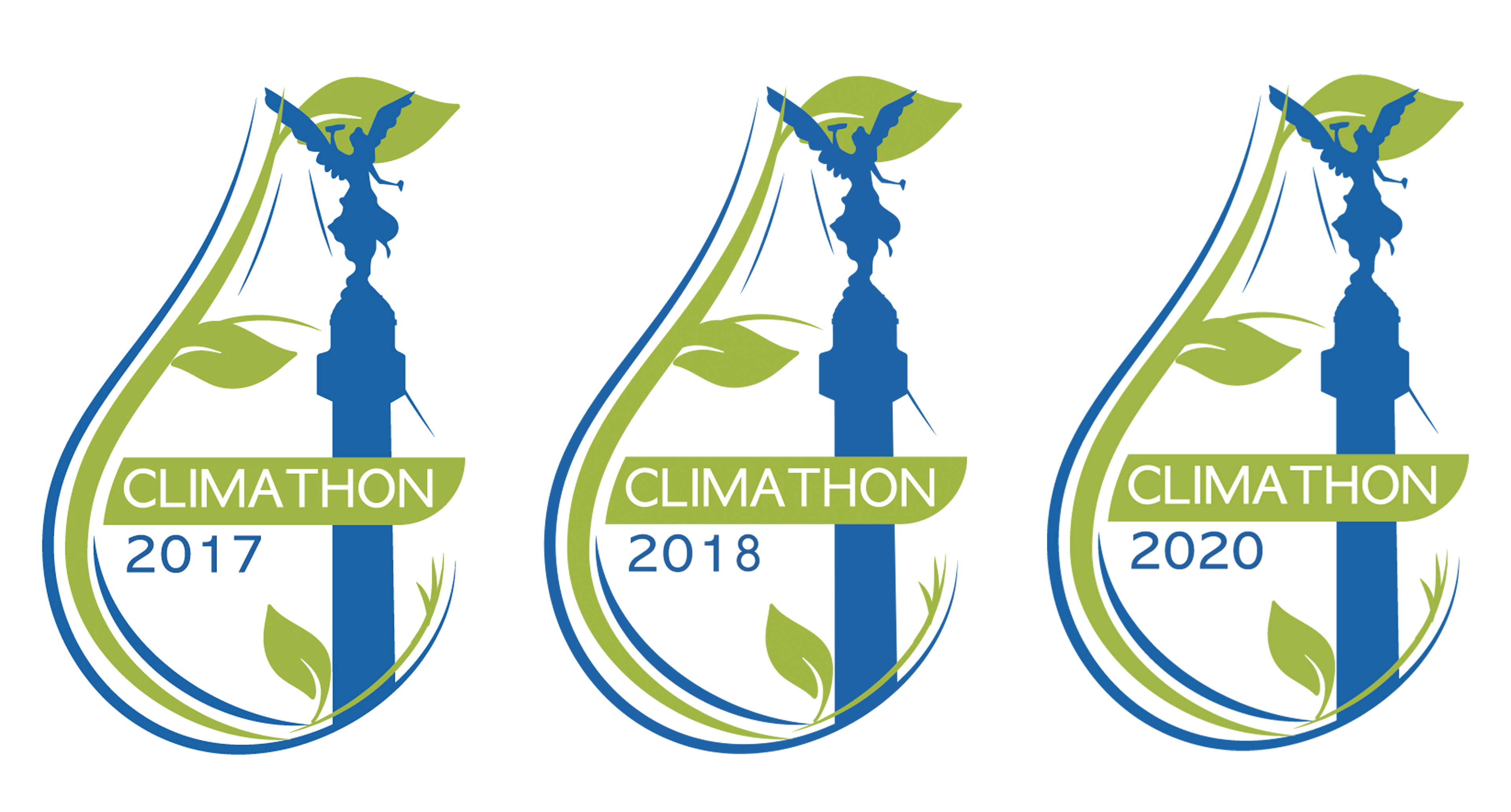
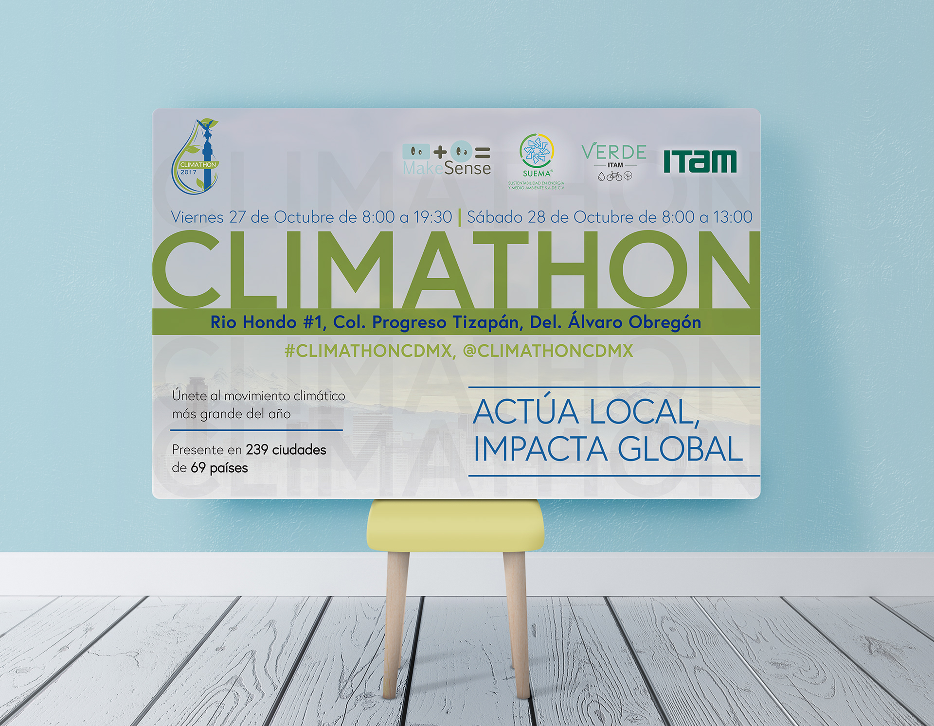
The first element created was the logo to represent Mexico City, as the country's main venue. Therefore, the logo is made out of the Independence angel located in the main avenue of Mexico City and run through the whole city. The Independence Angel is wrapped by a drop because lack of water in some neighbourhoods is the city's main problem. Besides, the outline of the follows branches and leaves drawings to depict nature. The logo includes the year of the version of the event, that can be changed easily.
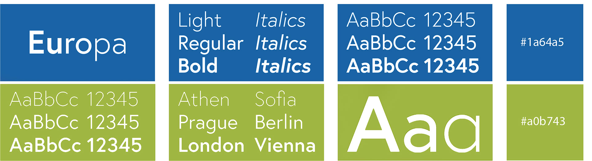
Typography: Europa
Europa typography was chosen due to its versatility because it can be applied in text or headlines and its closeness to popular humanistic typographies such as Futura or Gill Sans.
Europa is a Sans Serif type without contrast in its stroke and medium x-height; however, Adobe fonts offer 6 variants which is enough for the range of designs created for Climathon Mexico.
Colour Pallet
The colour pallet used for the design is blue and green because both colours represent nature, they are combined to create a sensation of vibrance, due to the way they contrast.
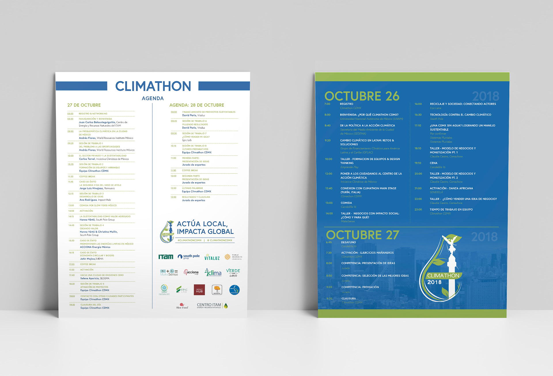
2017 and 2018 versions of the event's agenda.
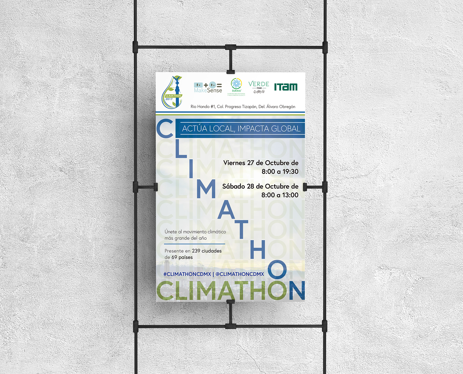
2017 poster for print.
2017 poster for print.
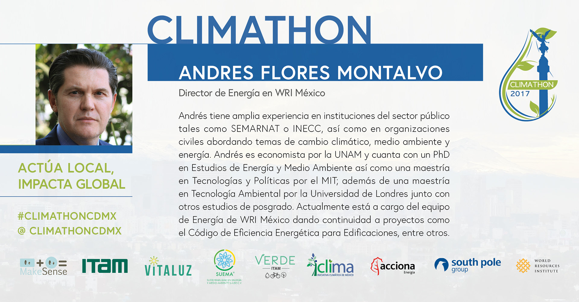
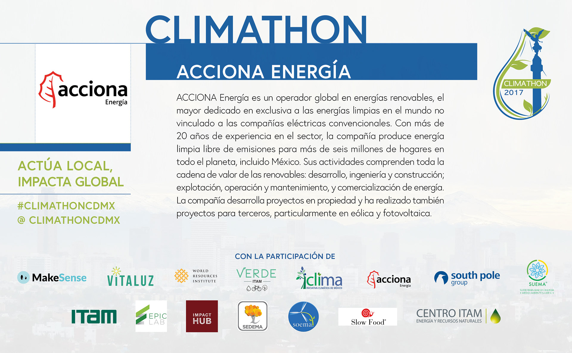
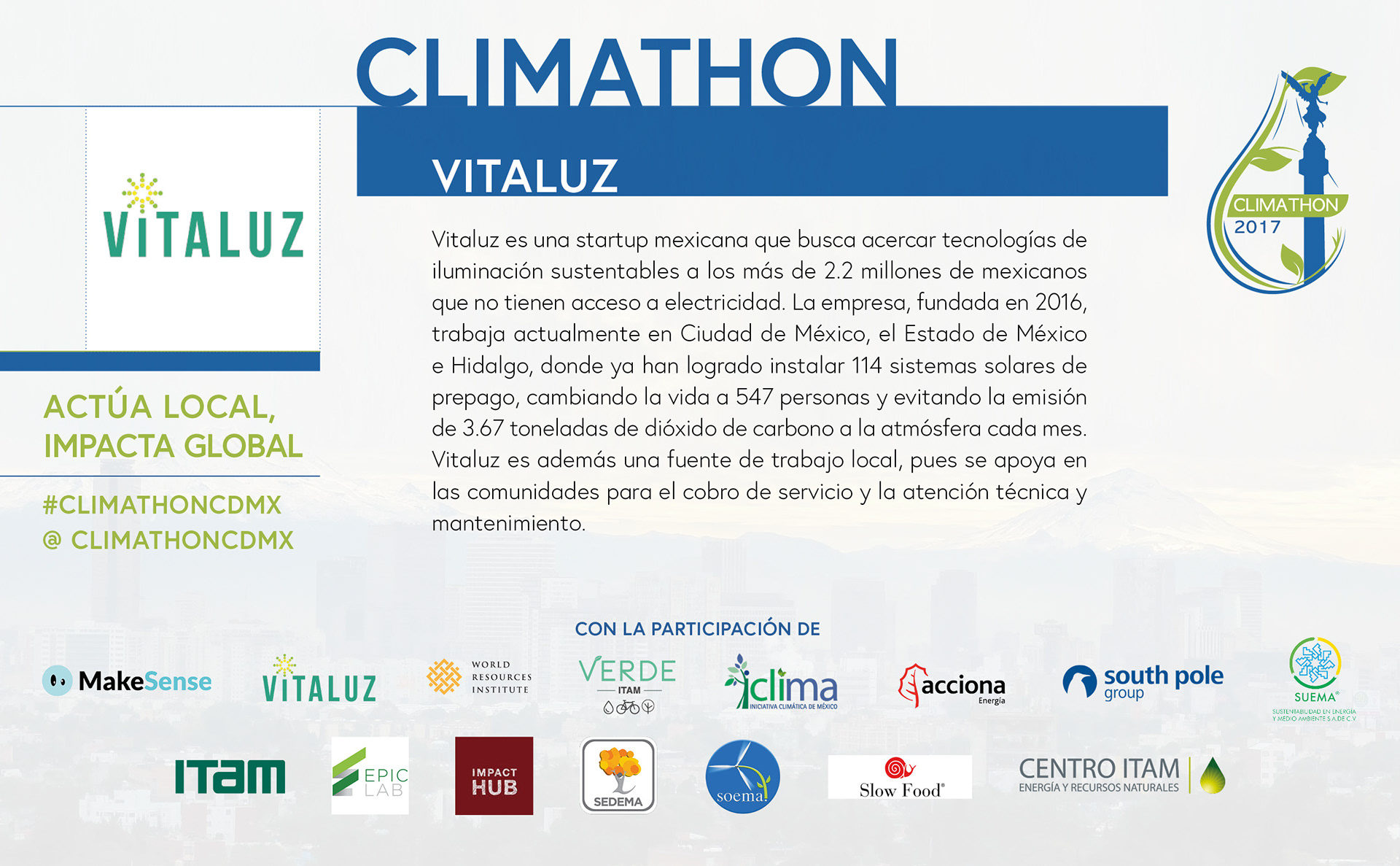
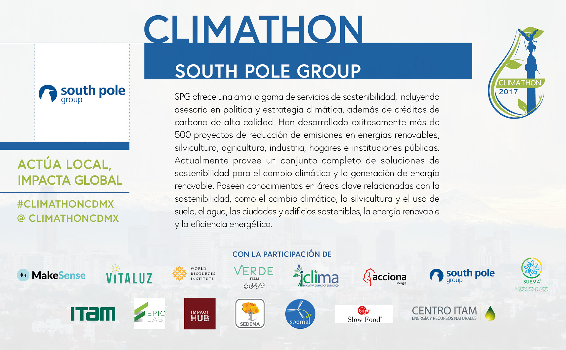
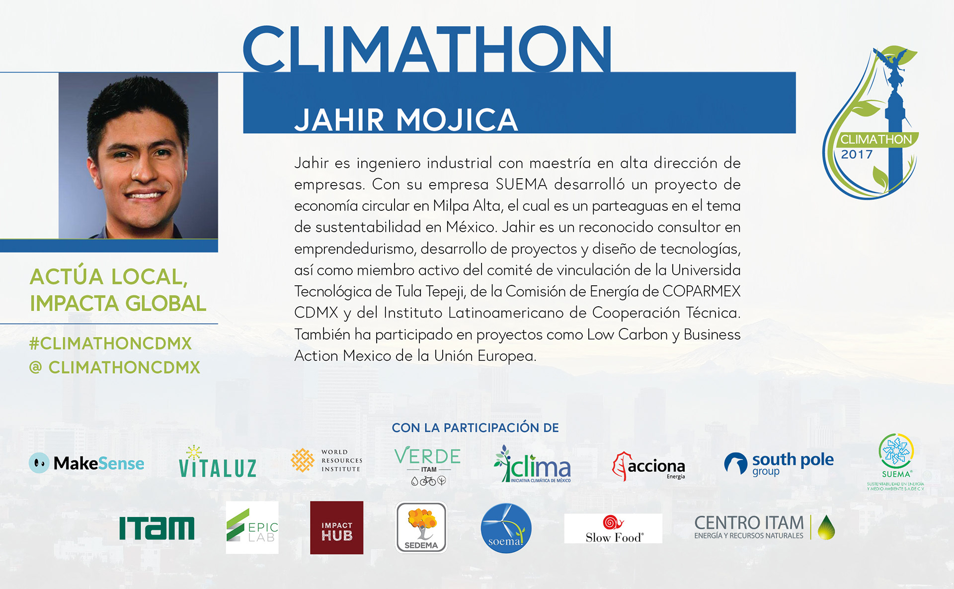
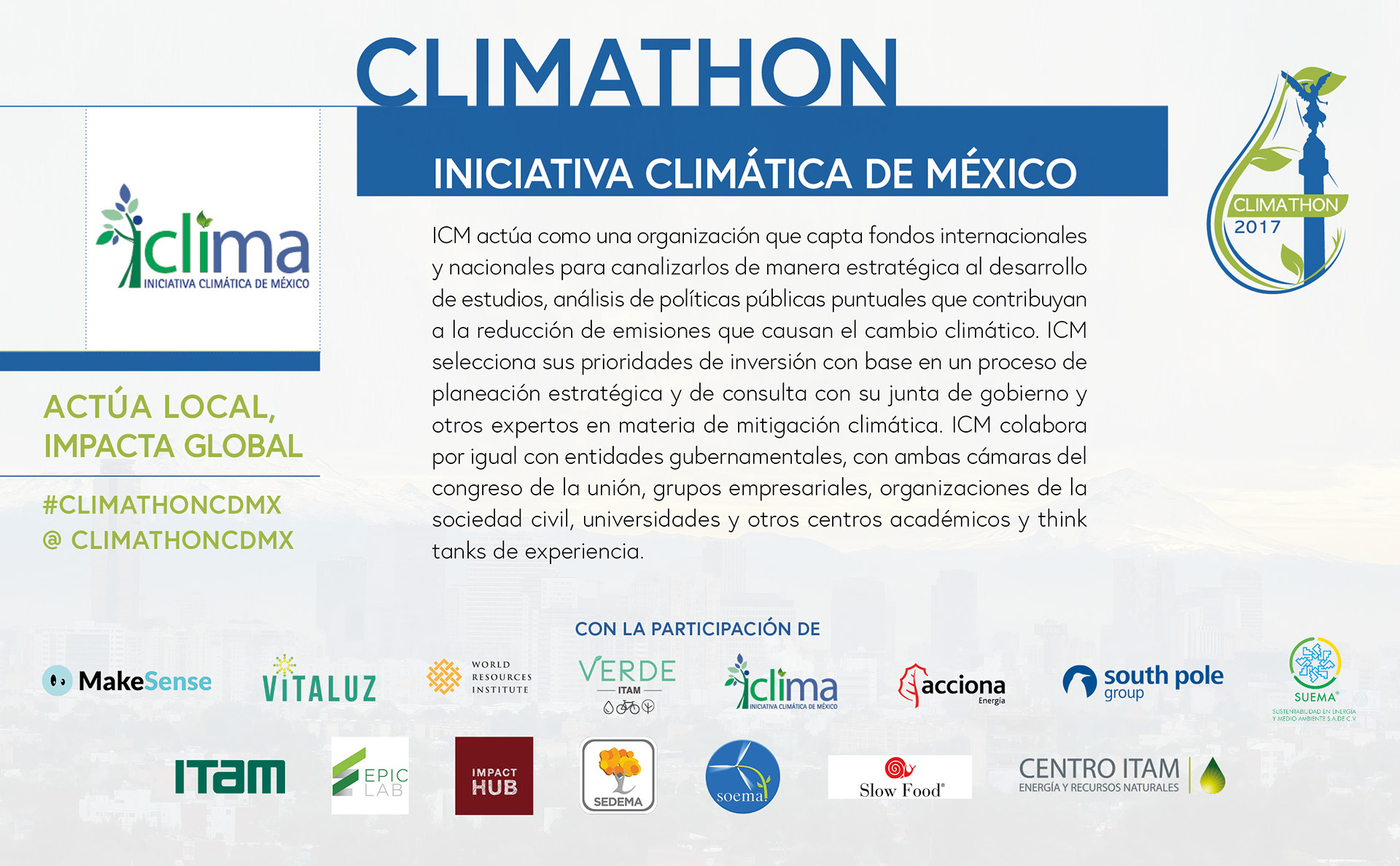
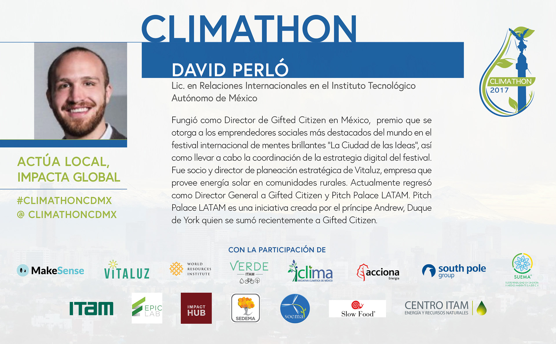
In 2017, the panellist and sponsors' information was distributed through mailing and social media as a banner.
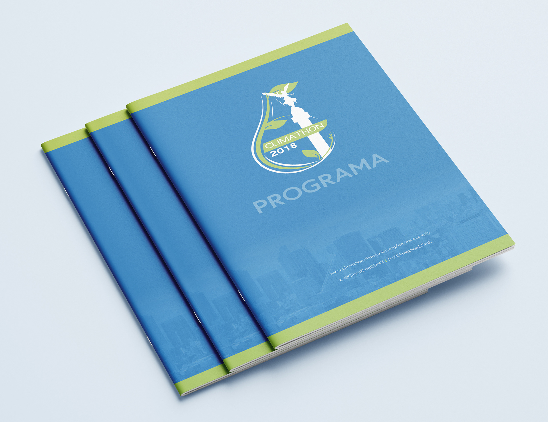
By 2018 the Mexican committee of Climathon decided to spread the event's information through a program due to the increase of sponsors and panellist.
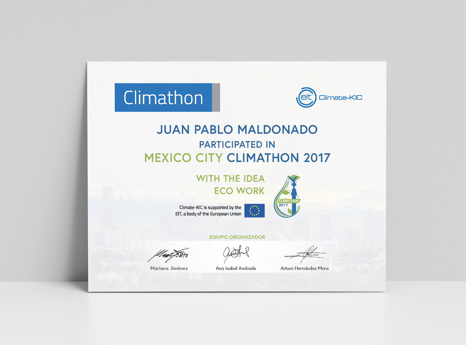
In both years 2017 and 2018, there was a recognition given to panellists, and the event participants have the same design.