Colibrí Magenta's magazine it's a project that took around four months. These magazine its mostly build on spreads and a few individual pages, in which each piece reflects the content's personality. In its Second edition, Colibri Magenta collaborated with "Follow Control" and the festival of wine "Festival Toma Vino Mexicano 20." Therefore, pieces about wine and leisure dominate the editorial content. In contrast, the essential article of the magazine it's about Tatiana Clouthier; hence the cover page only carries a picture of her showing her character and small text highlighting the article "Festival Toma Vino Mexicano 20.
Between 2 or 4 proposals were made for each piece to ensure synergy between design and content. Only in a little case, a first proposal was chosen.
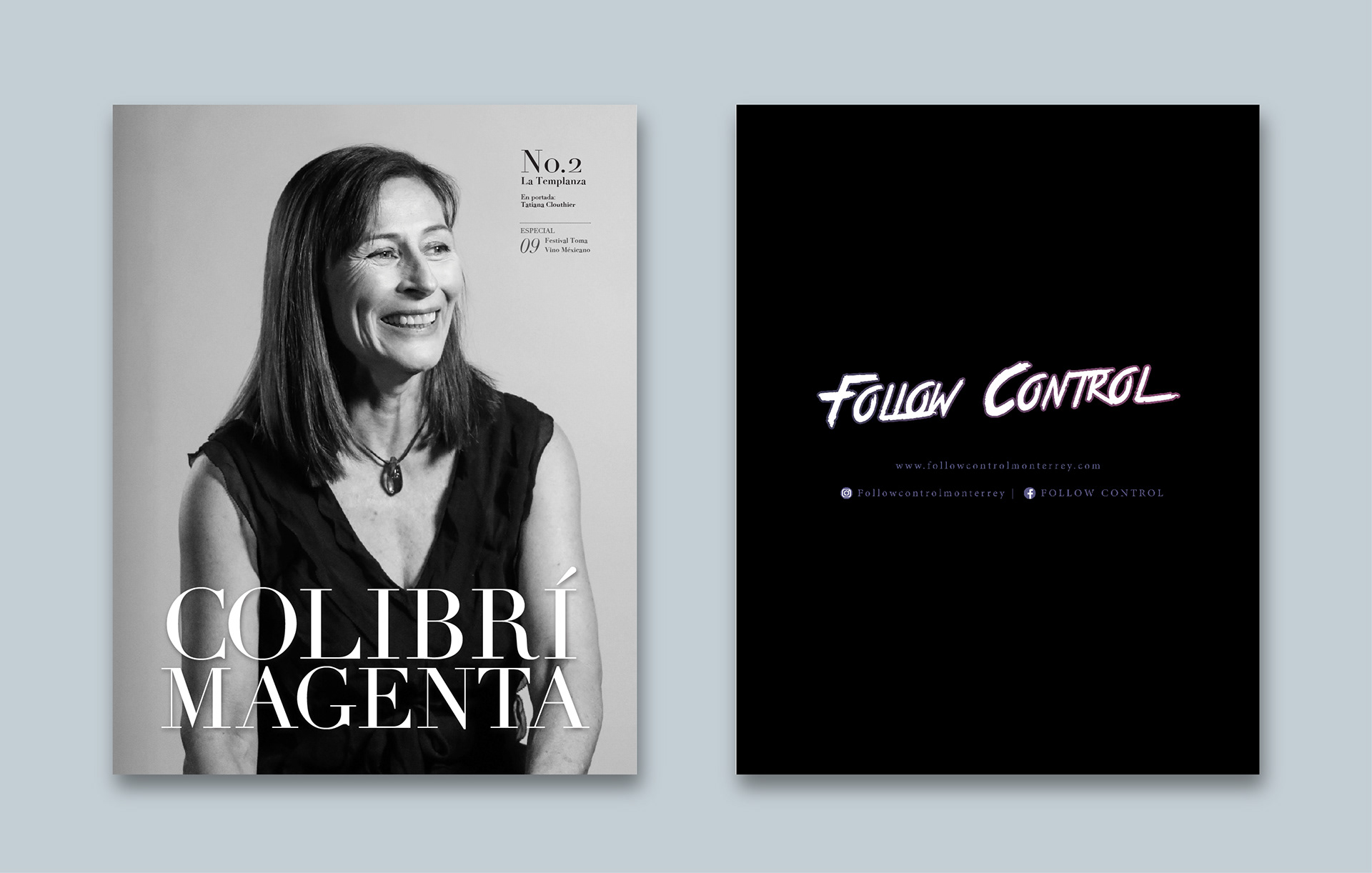
Front Cover and back Cover
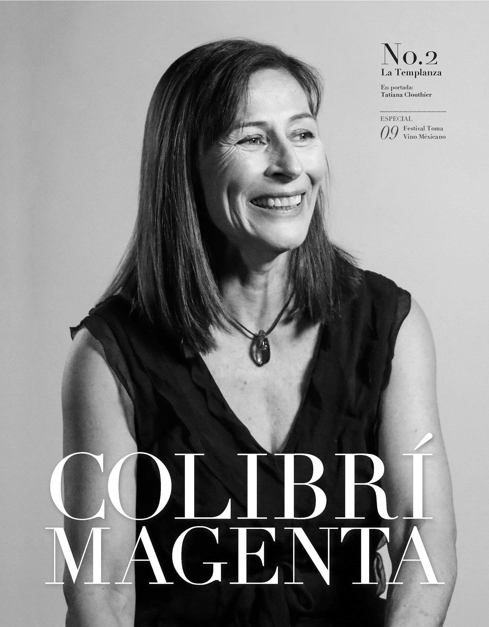
Final Proposal of the Front Cover.
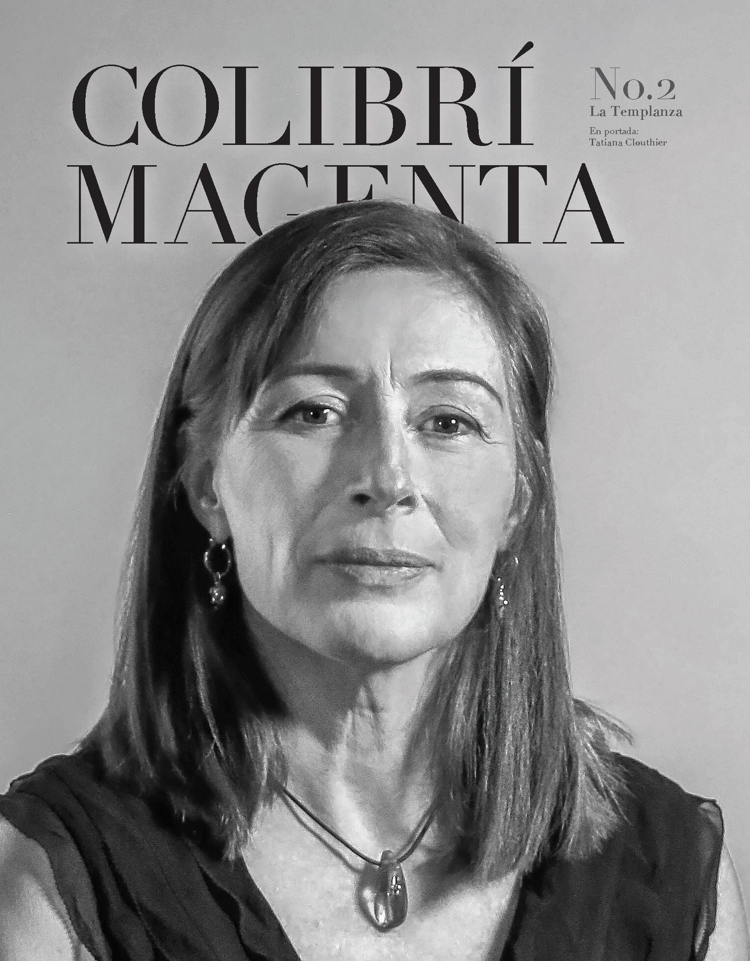
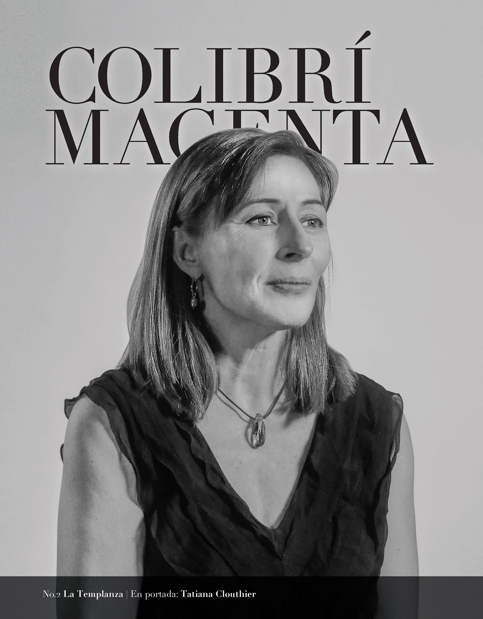
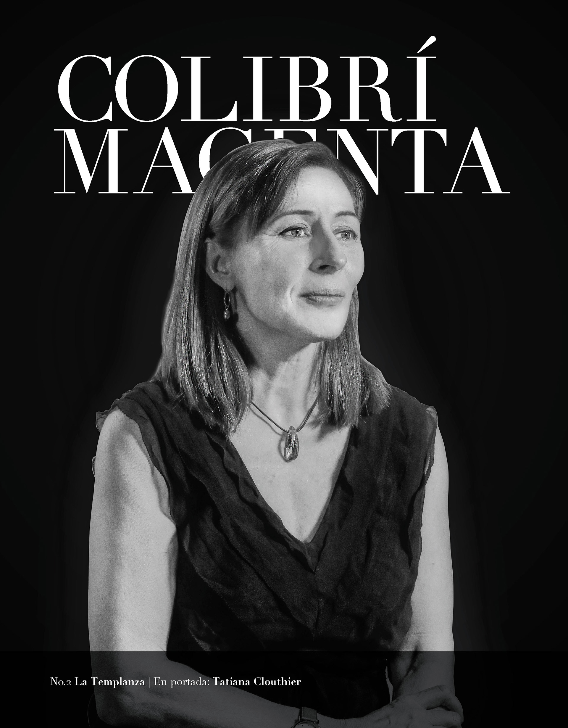
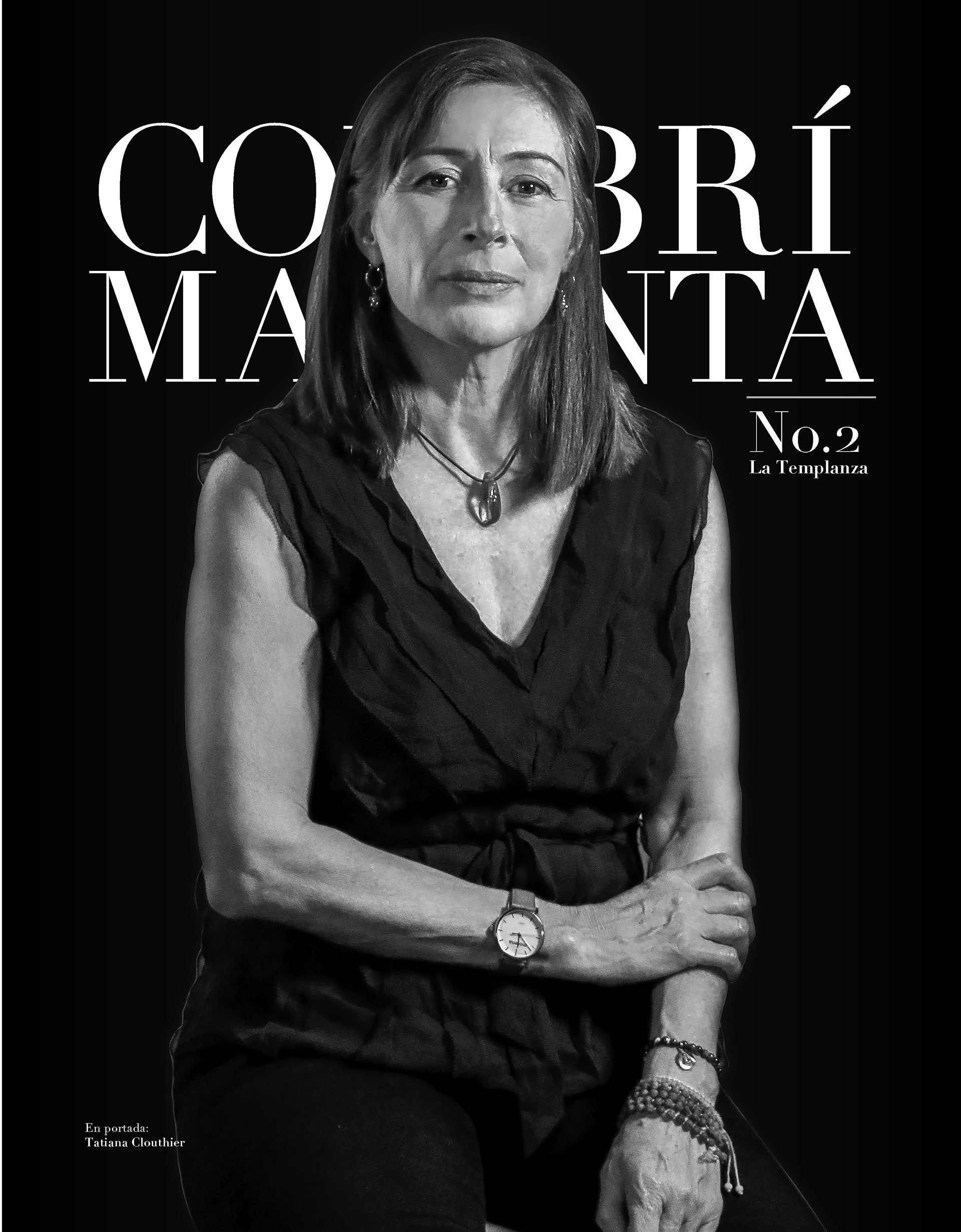
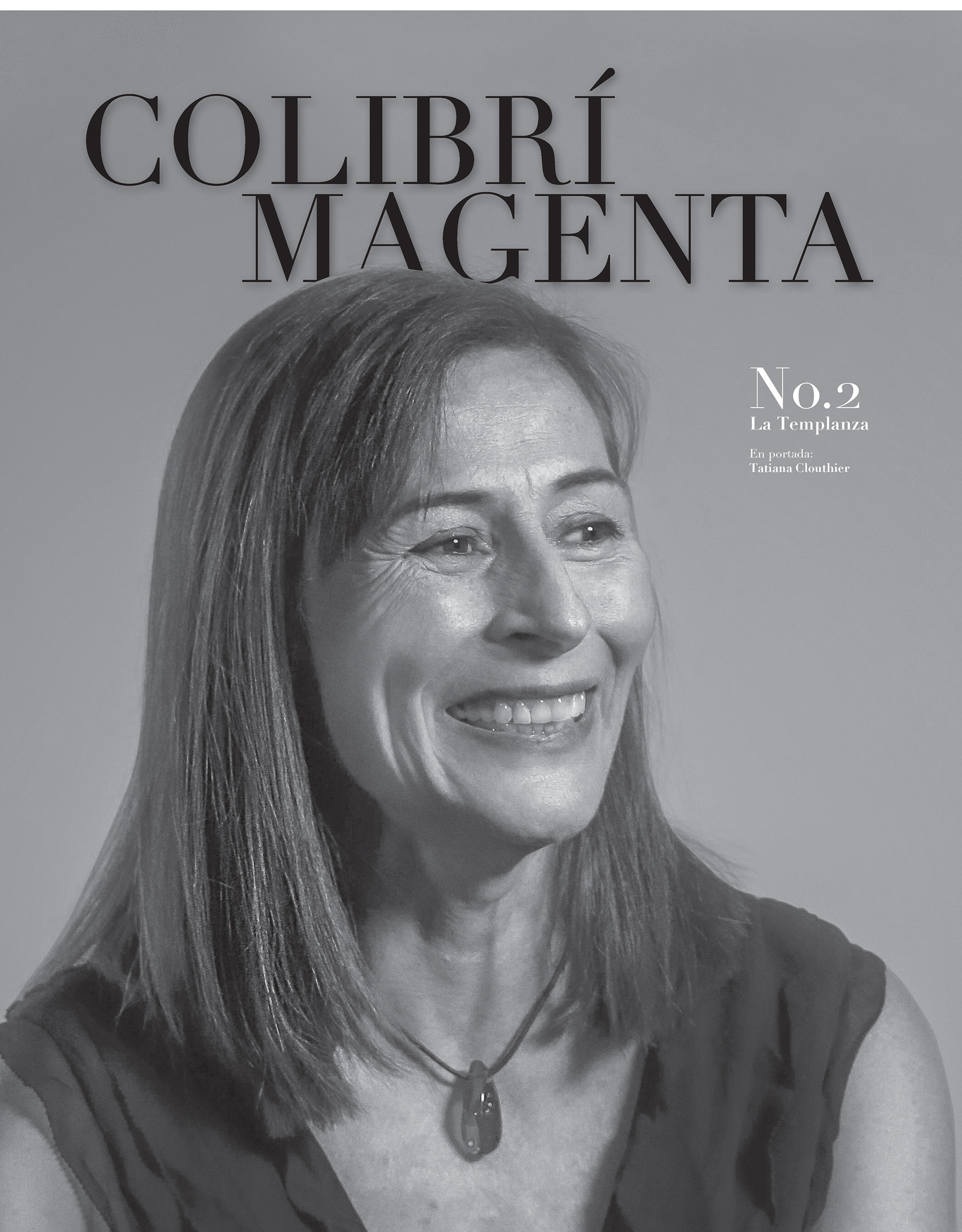
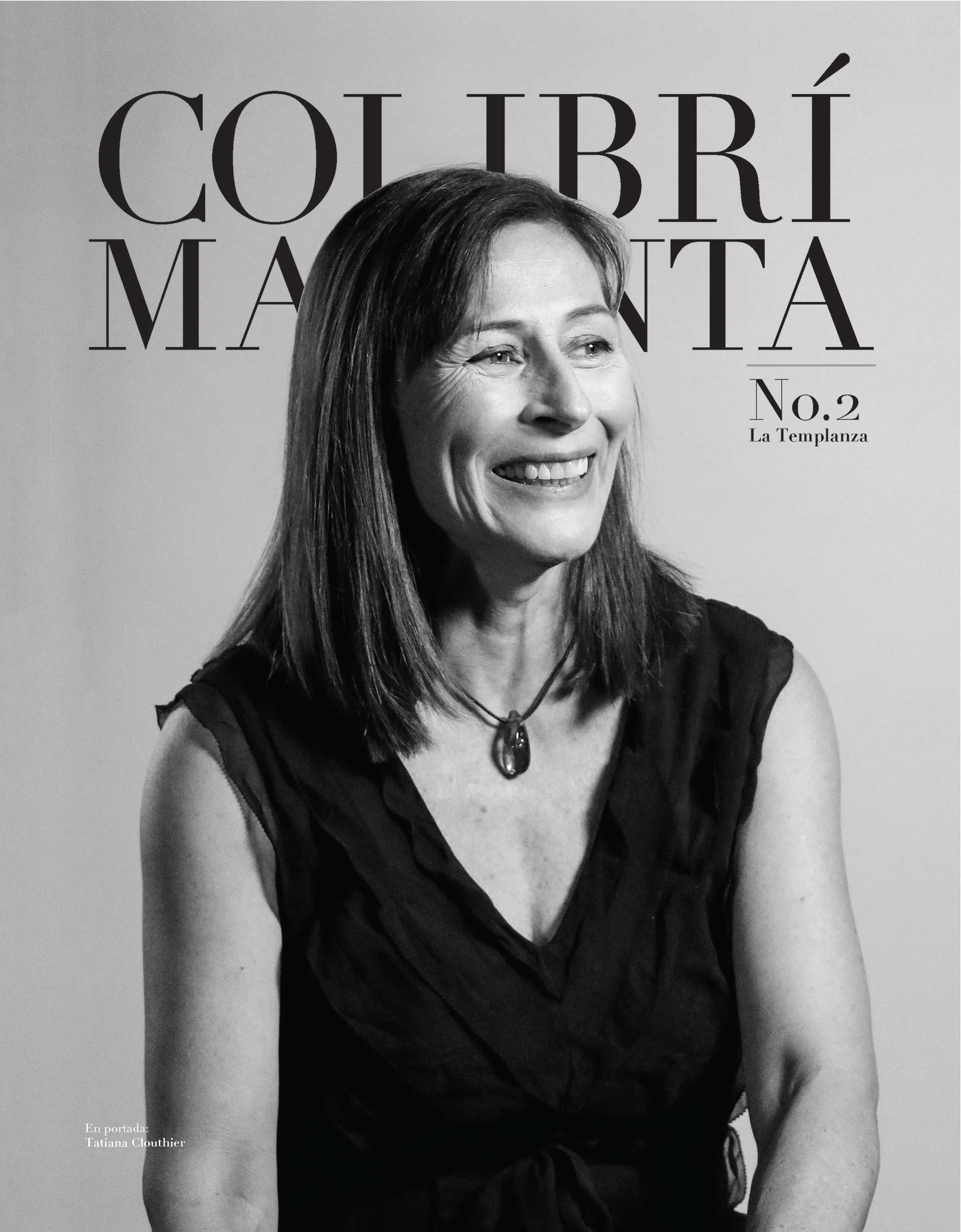
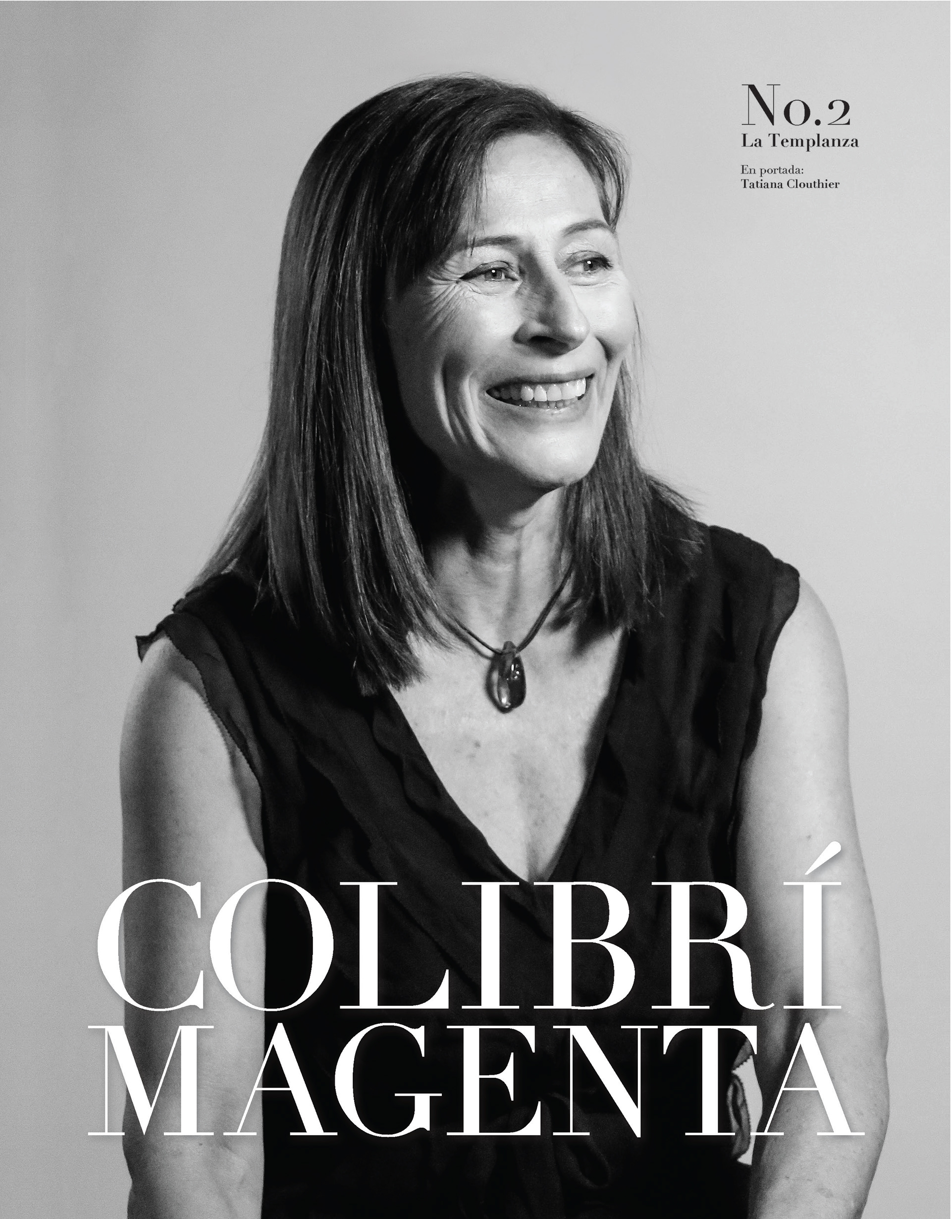

Around ten proposals wee made for the front cover, due to the importance of the content. The combination of photos and text should not be in the way of each other. On the contrary, the aim was to create an elegant and pleasant cover
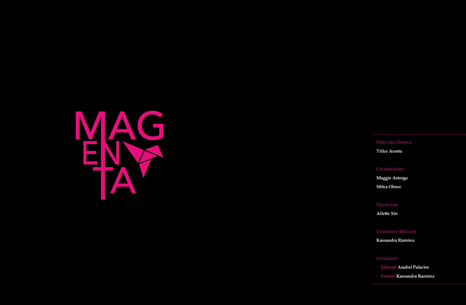
Credits and brand presentation
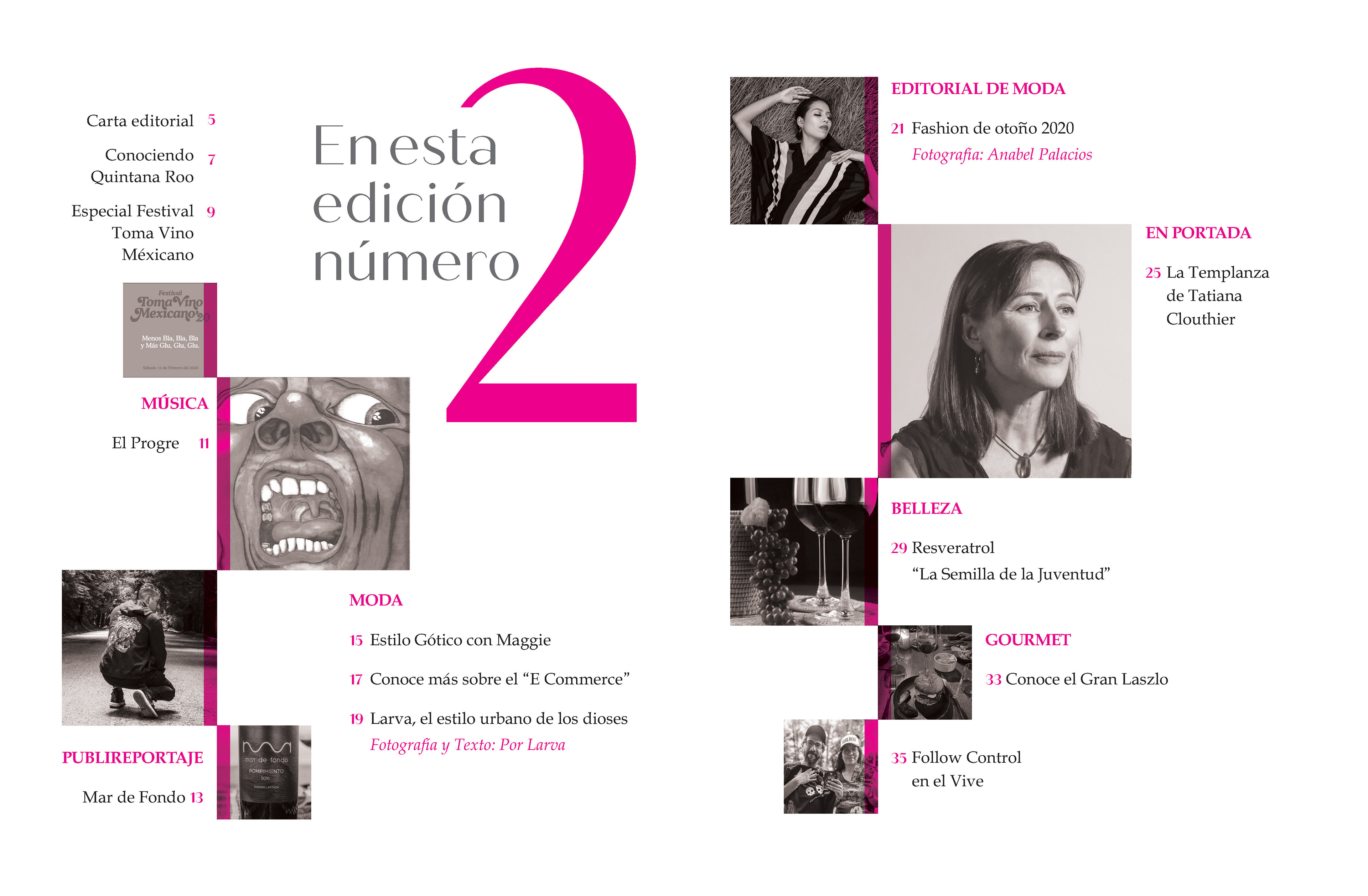
Final Proposal of the Index
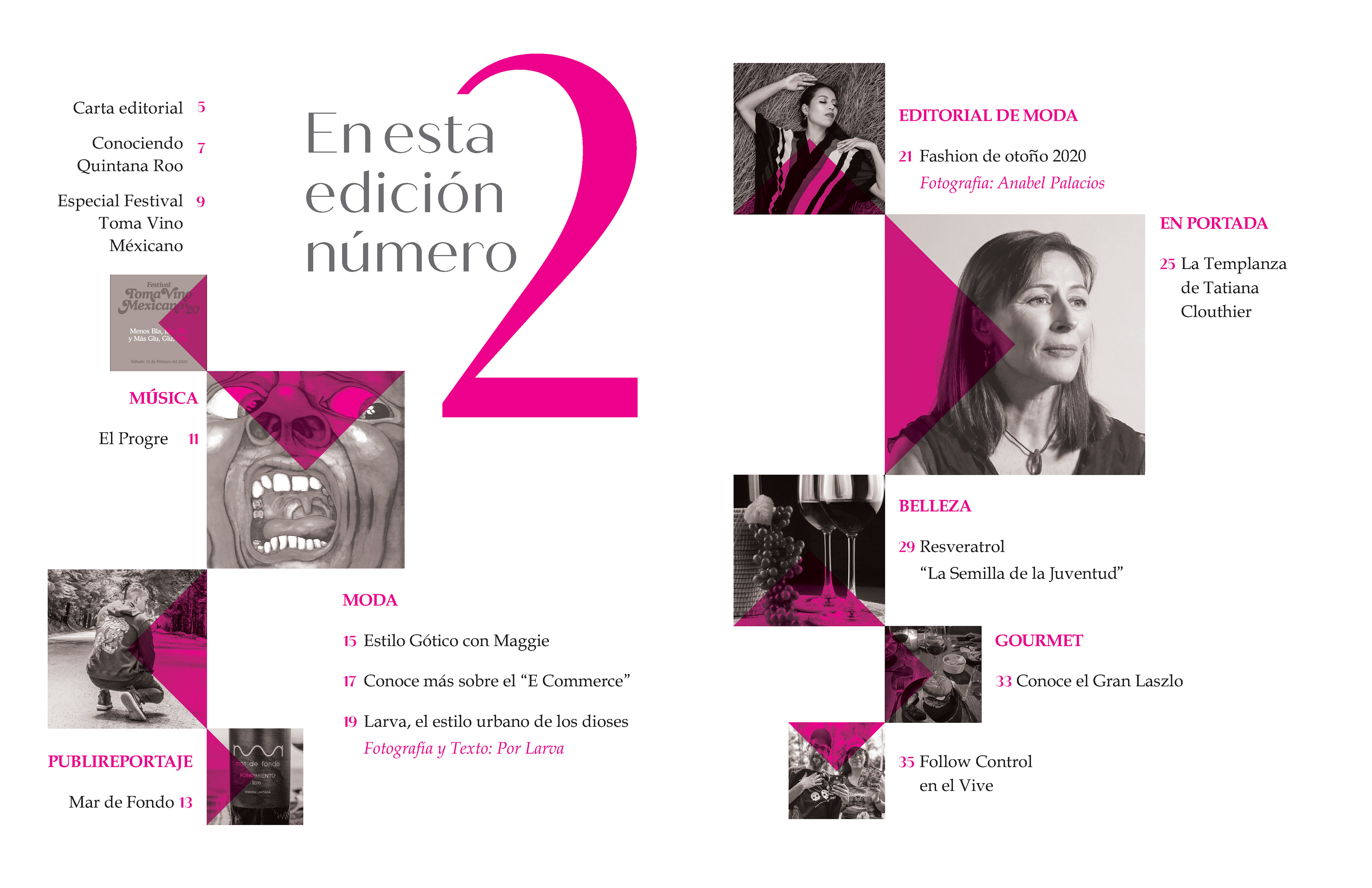
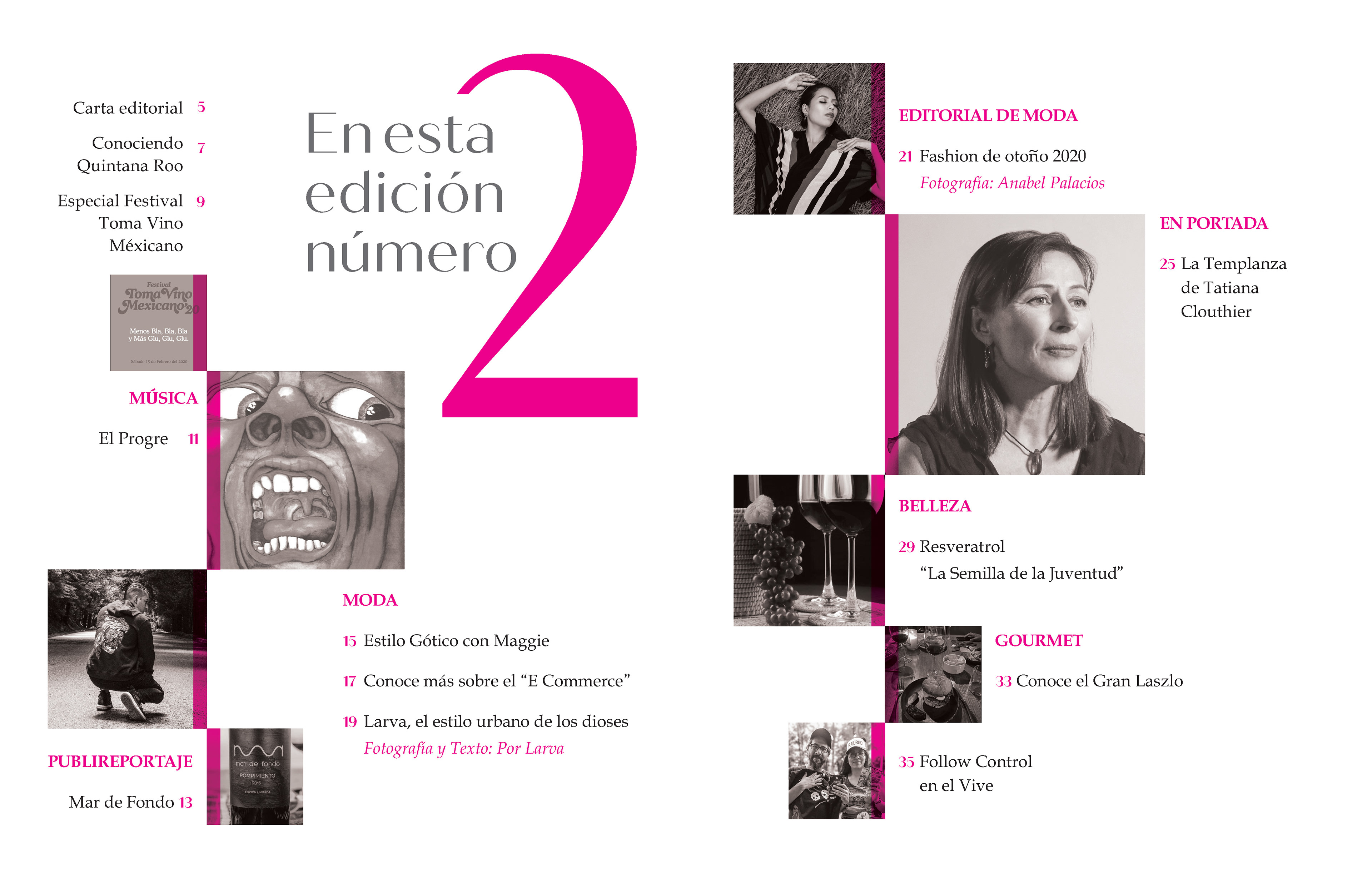
Both proposals of the index aim to highlight the brand's nature. In the end, the spread on the right was chosen since the detain within the picture is more discreet.
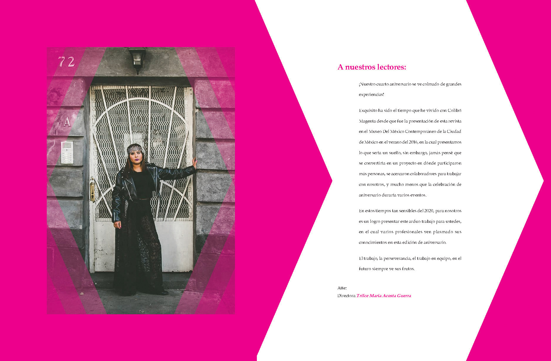
The general director of Colibri Magenta is Trilce Acosta, as she writes the editorial letter and many of the pieces in the magazine, it's only natural that she appears in this spread. (Special thank you for letting me collaborate in this project, I absolutely love it)
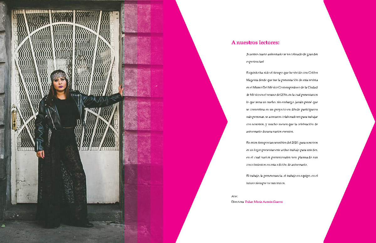
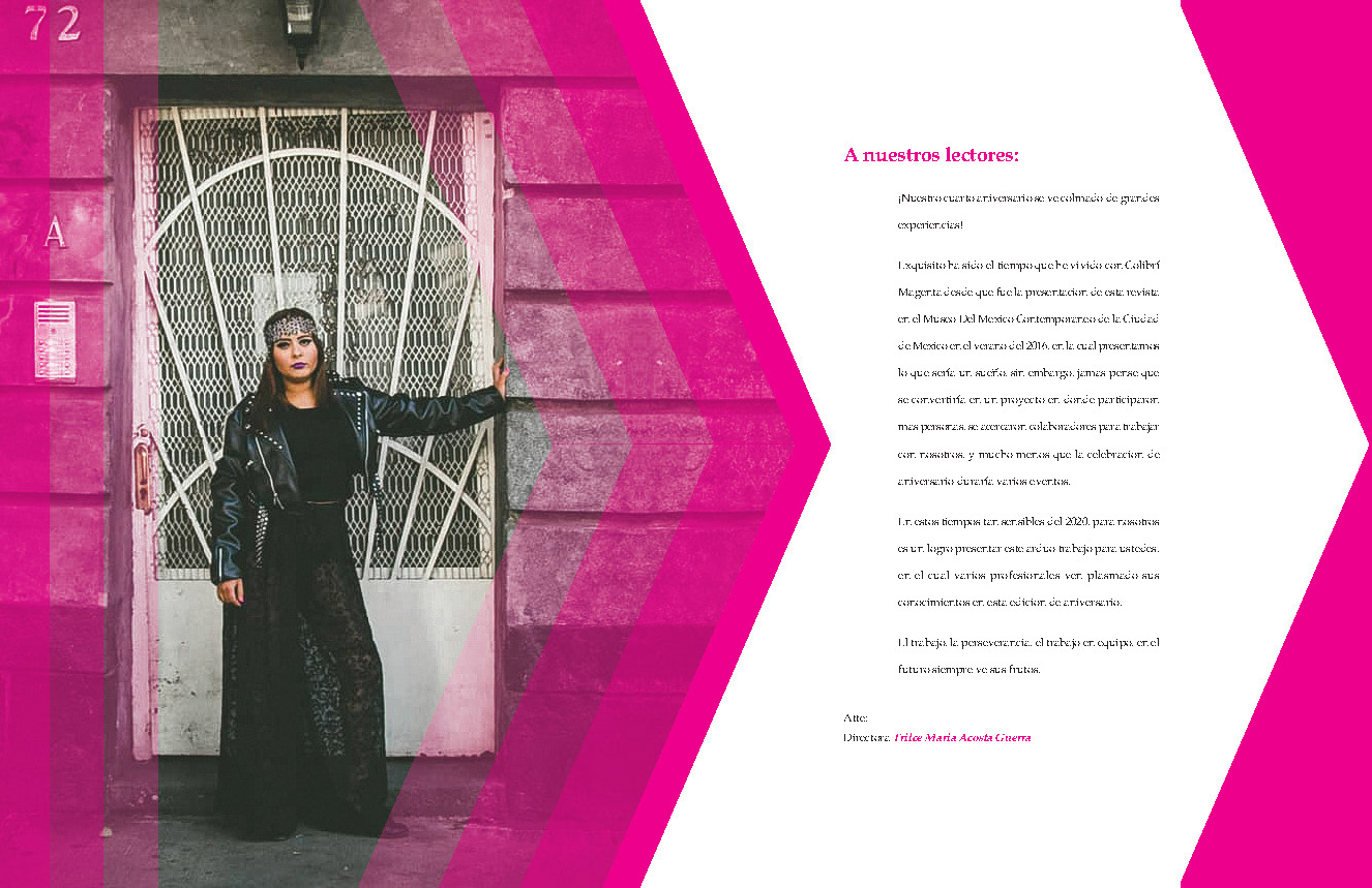
Proposals of the editorial letter with her photograph included.
This proposals of the editorial letter were made while Trilce's photo went through the decision process.
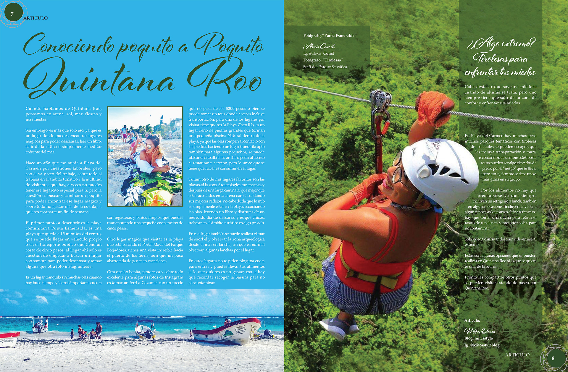
Final Proposal of "Conociendo poquito a poquito Quintana Roo"
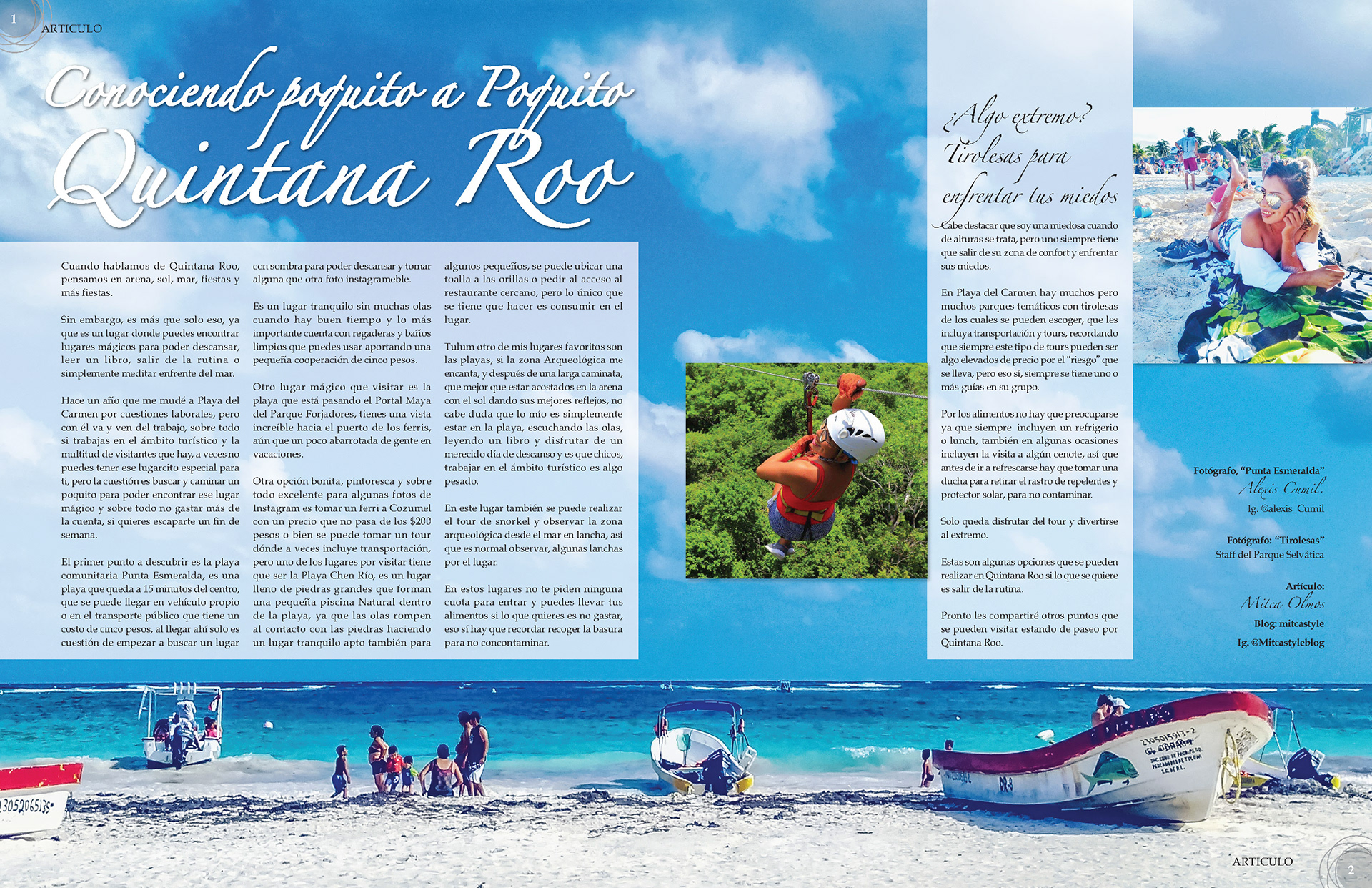
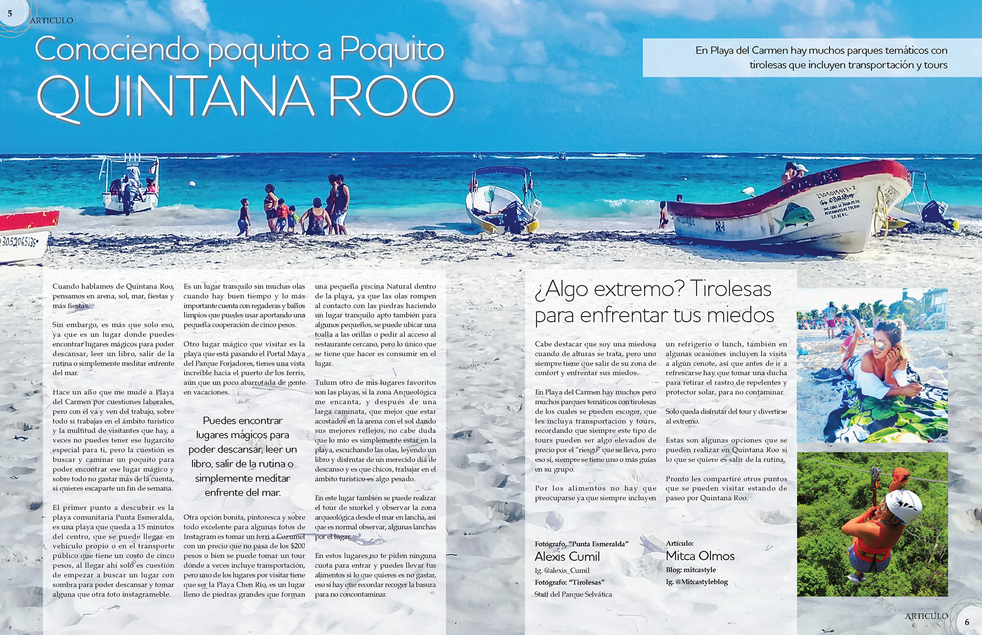
This proposals of "conociendo poquito a poquito Quintana Roo" highlights aims to highlight the beach, unlike the final proposal which it's more about the fun activities that tourist can practice in Quintana Roo.
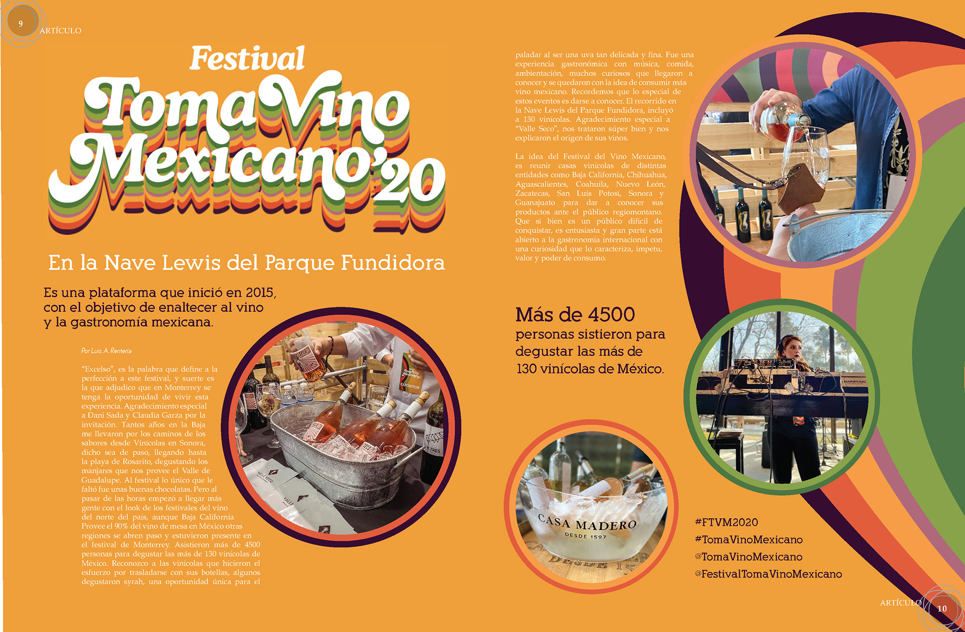
Final Proposal of "Festival Toma Vino Mexicano' 20"
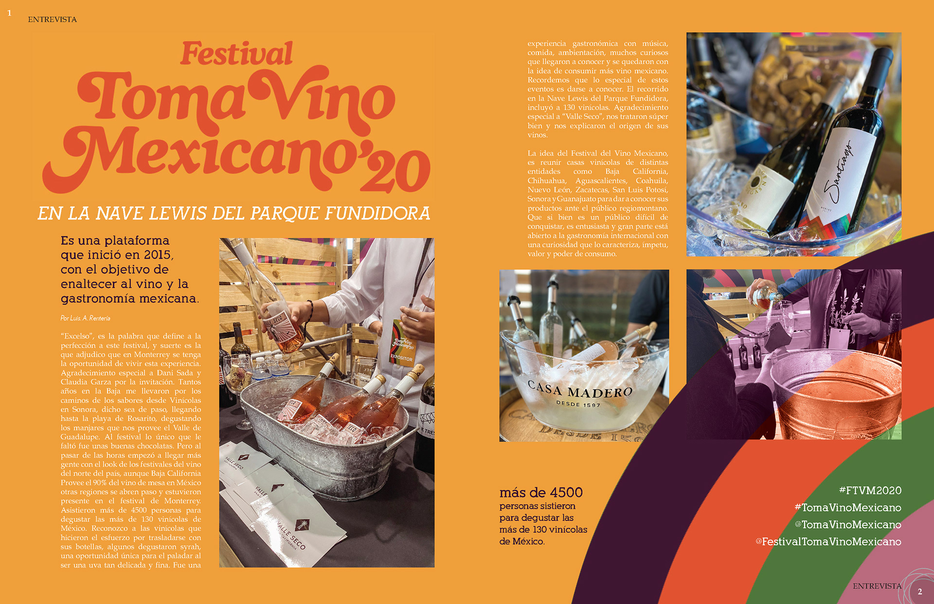
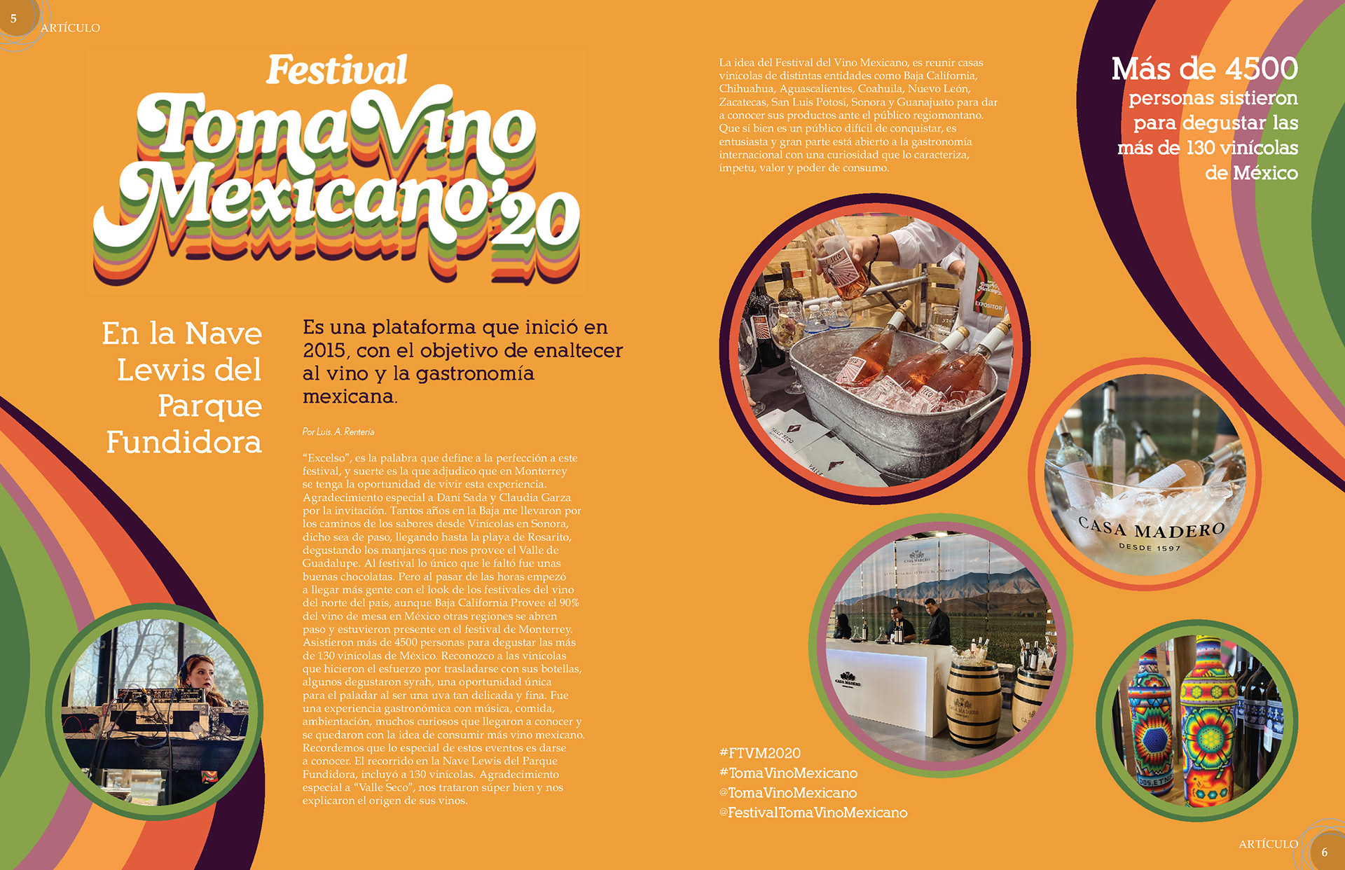
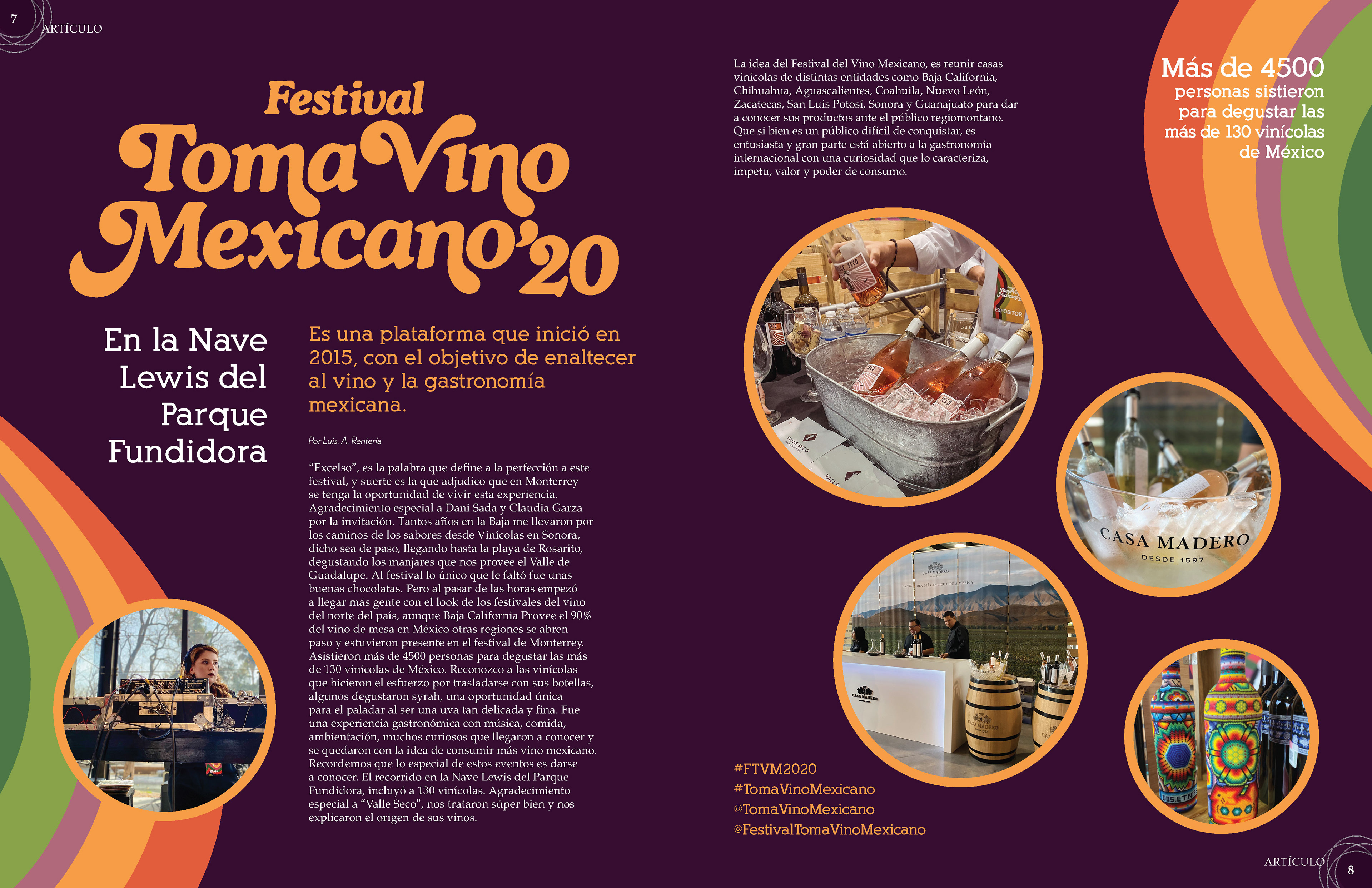
Four spreads were created for this content, playing with the colours of the logo and using a layout ruled by the funky forms of the colourful waves.
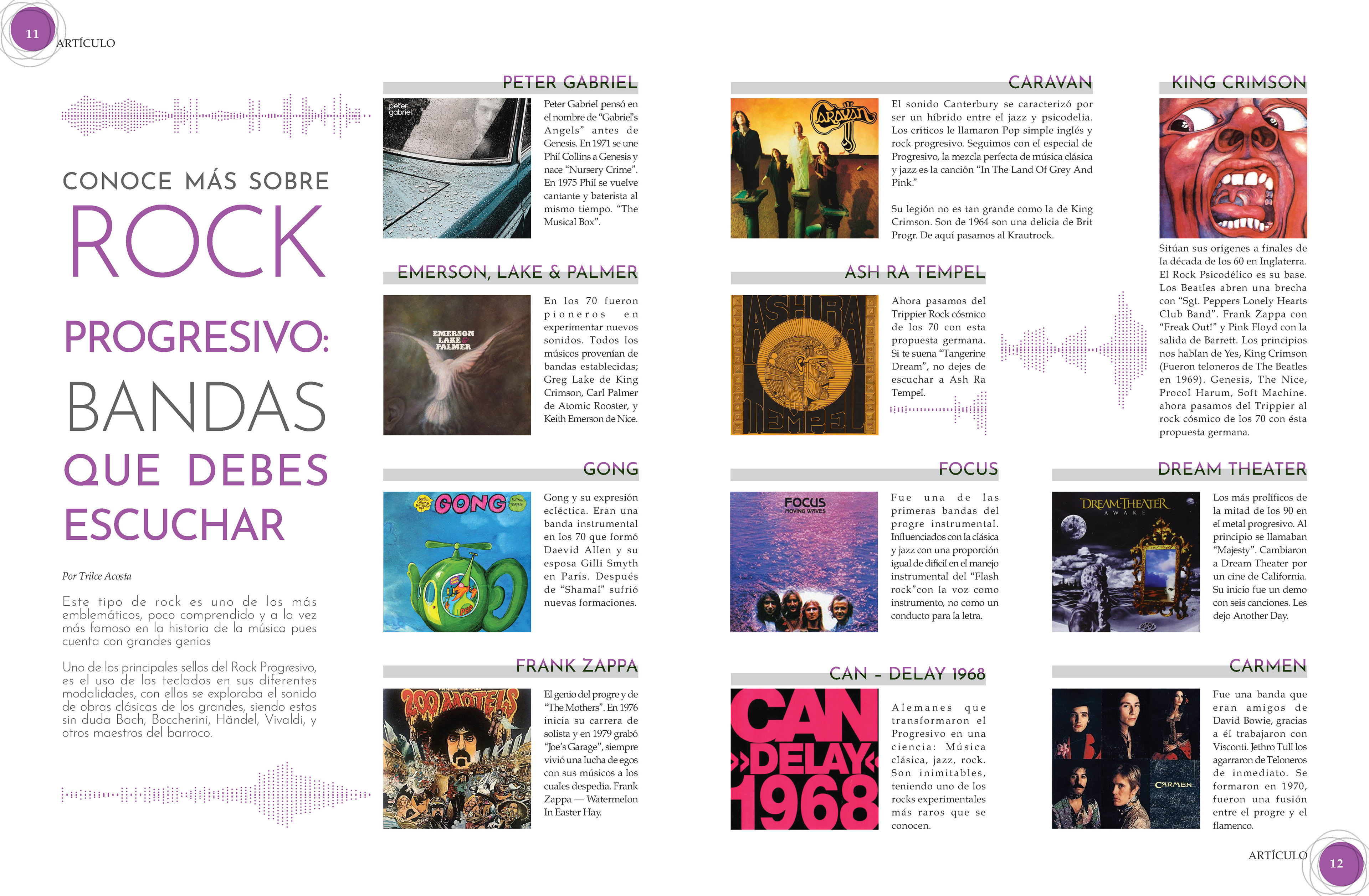
Final Proposal of "Rock Progresivo, bandas que debes escuchar"

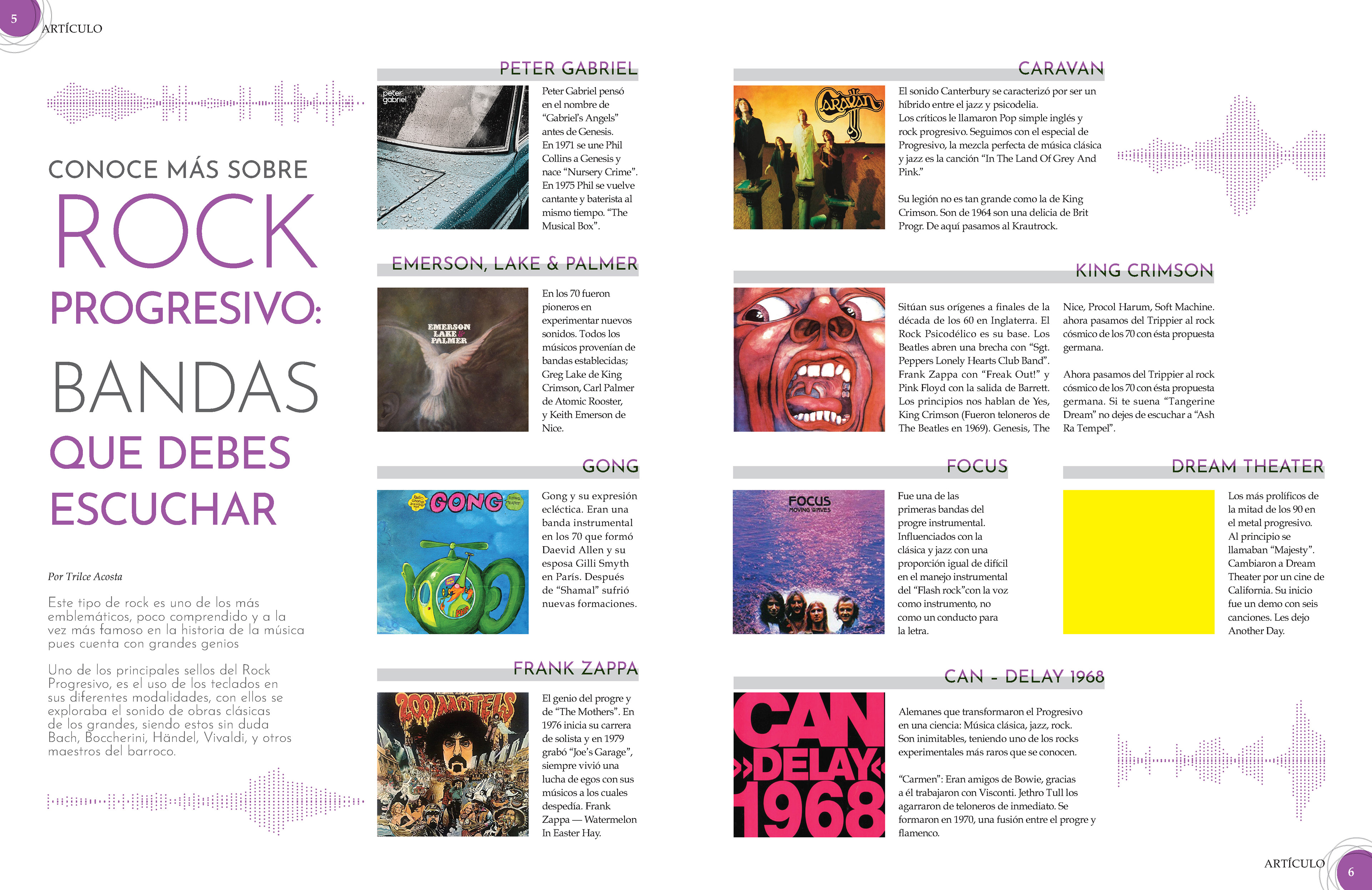
Two proposals were made before the final choice of progressive rock; both of them convey through the graphics and forms around the pages the musical content.

Final Proposal of "Conoce a Edgar Nieto y Mar de Fondo"
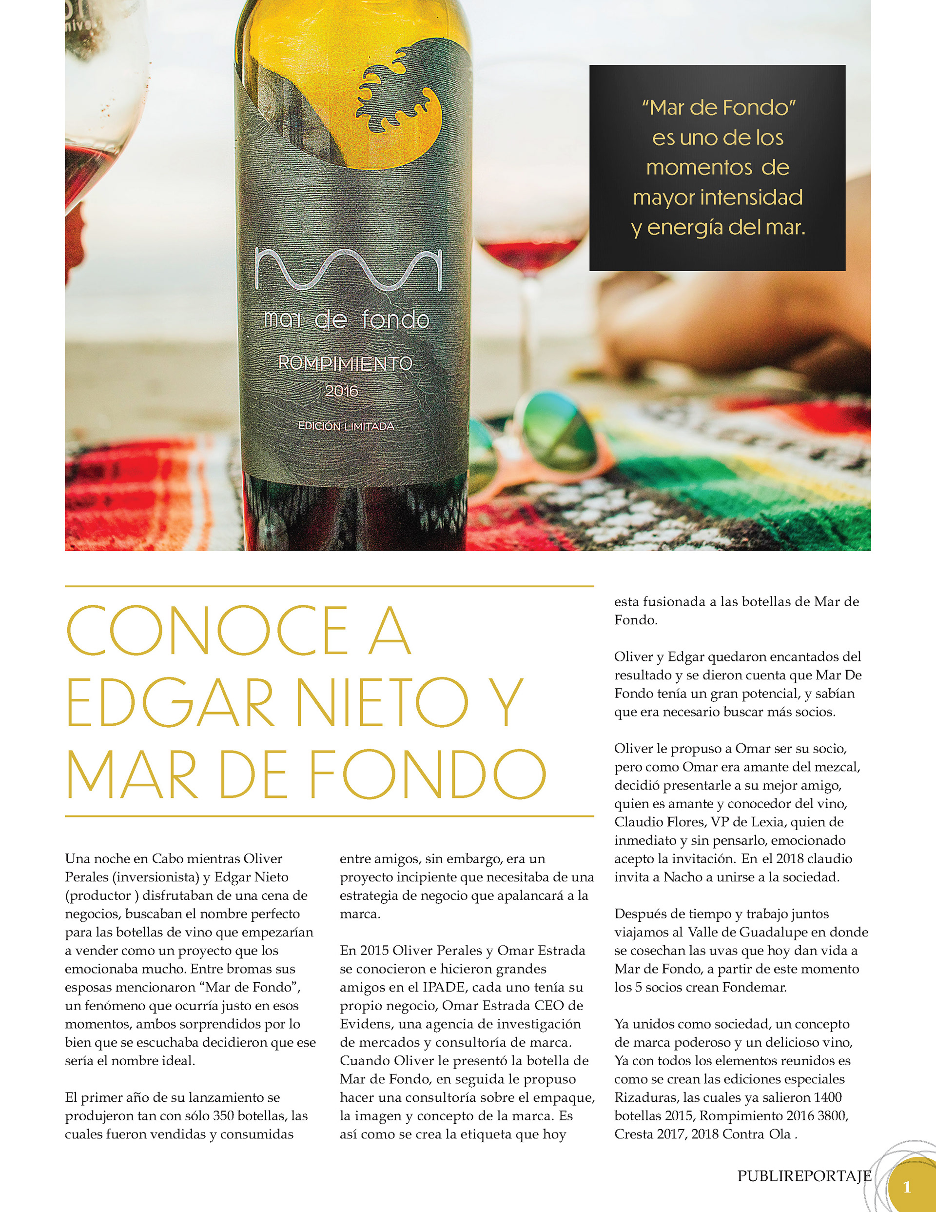

This piece was mean to be only a single page, but due to the extensive content, it became a spread. This decision was beneficial because the final version showcases as dominant graphic in the design, the bottle of wine which express the aim of the piece.
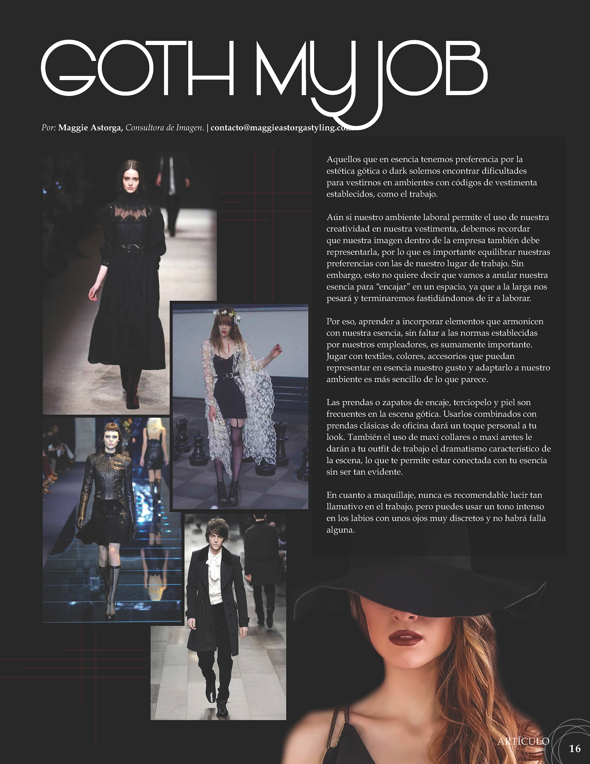
Final and only proposal of "Got my Job"
Got my Job its about the possibility of using gothic style to go to work, not only the headline tents to express the content, but also the background and picture at the right corner.
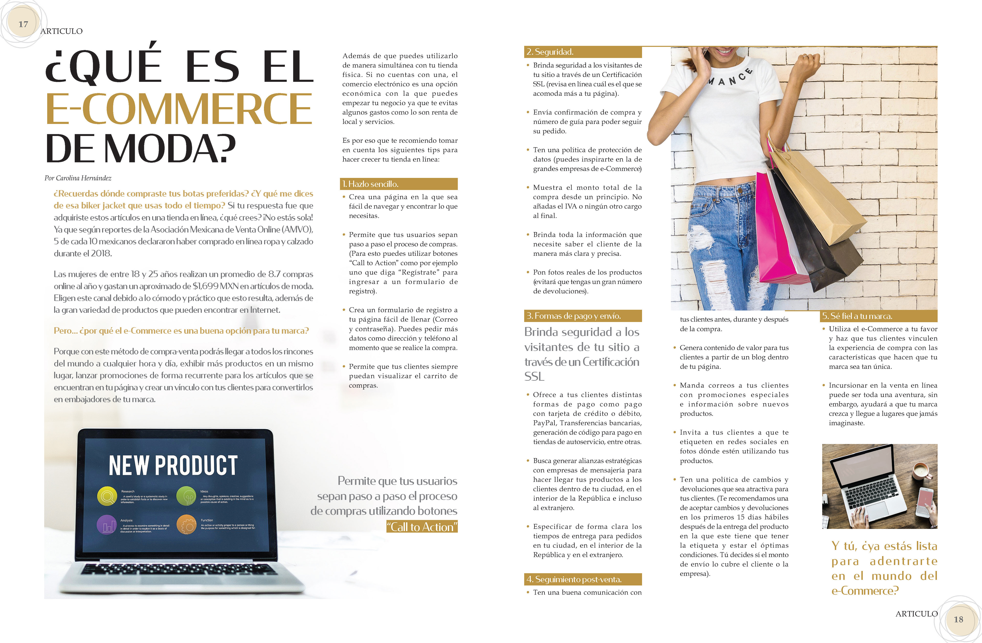
Final and only proposal of "Que es el e-commerce de moda"
"Que es el e-commerce de moda" is an article intended to be serious and easy to read, so the content is divided into bullets with each section marked by the style of the titles. Even so, in order not to fall into monotony, the photos serve to break the square style of the design.
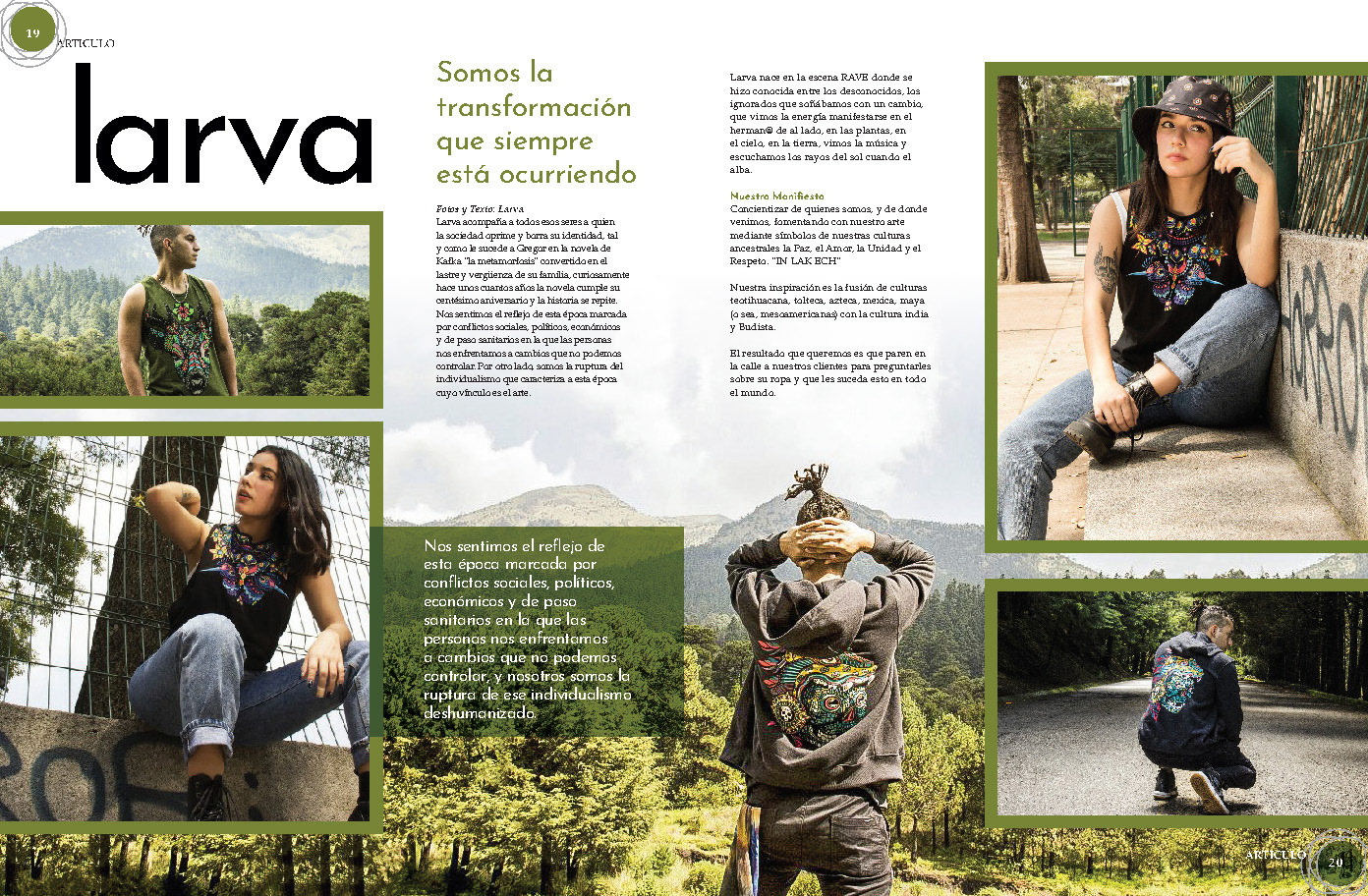
Final Proposal of "Larva"
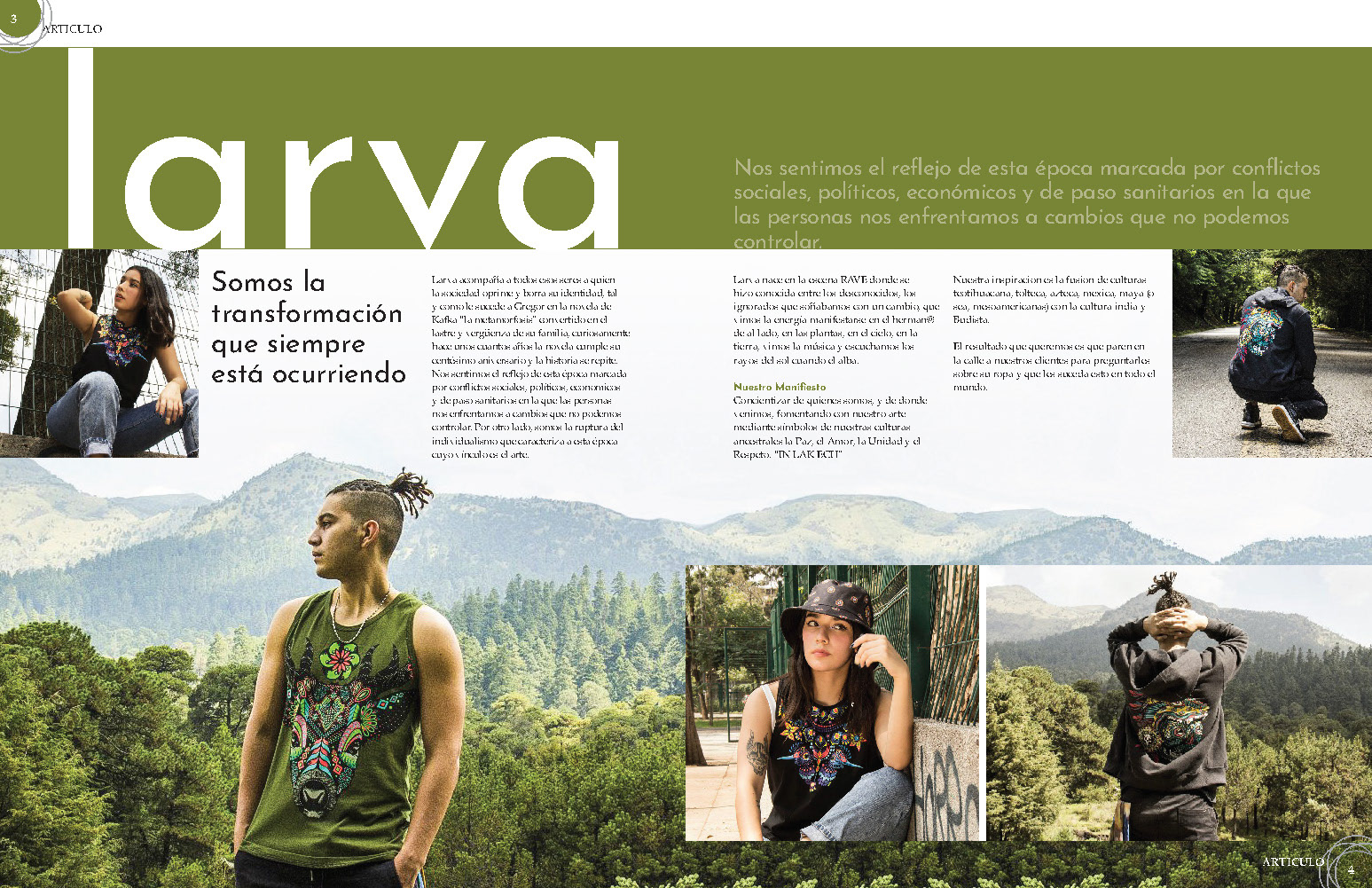
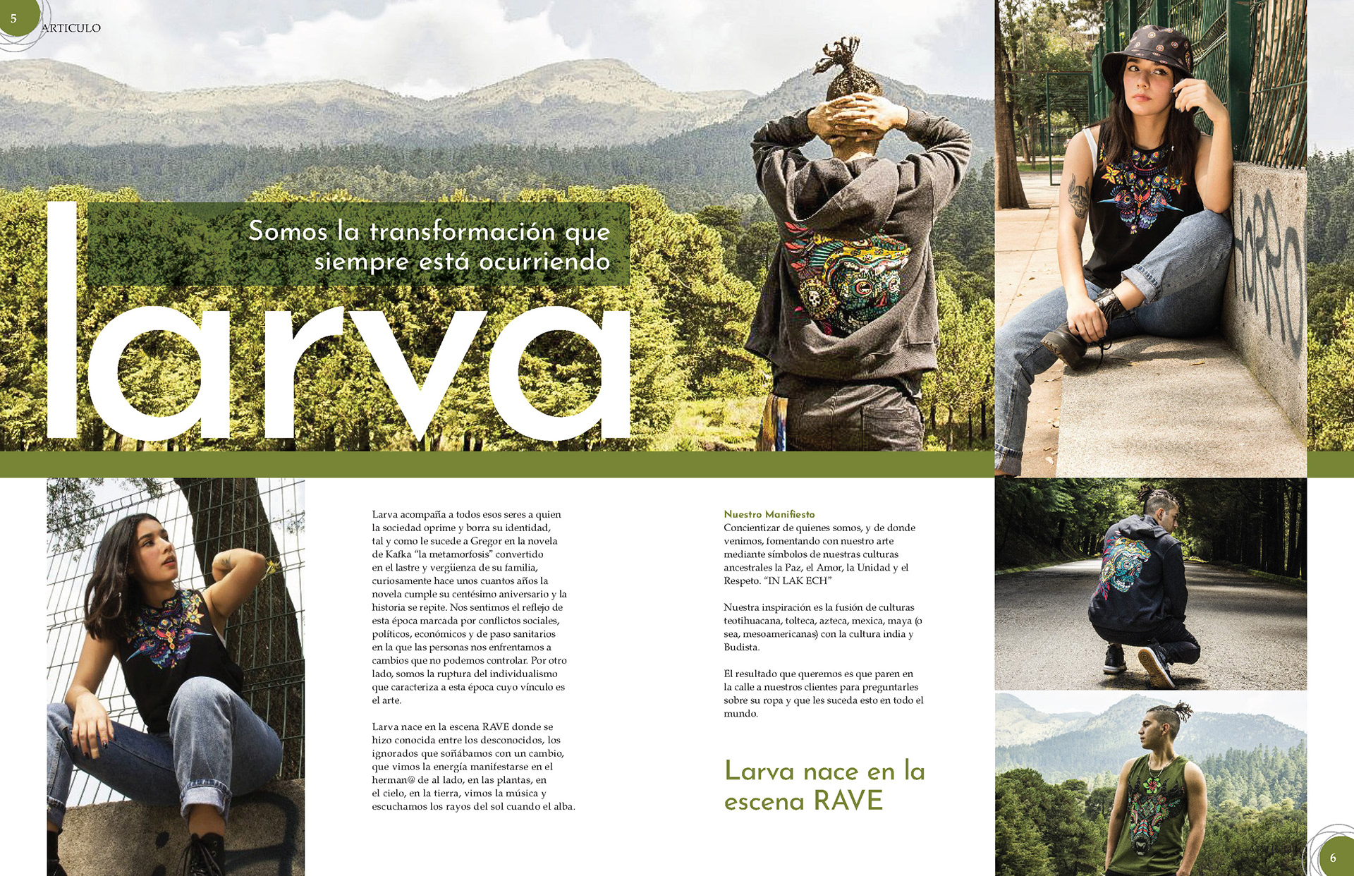
This article aims to highlight the synergy on the fashion brand Larva to nature. Therefore the green was extracted from the main picture and use around the article.
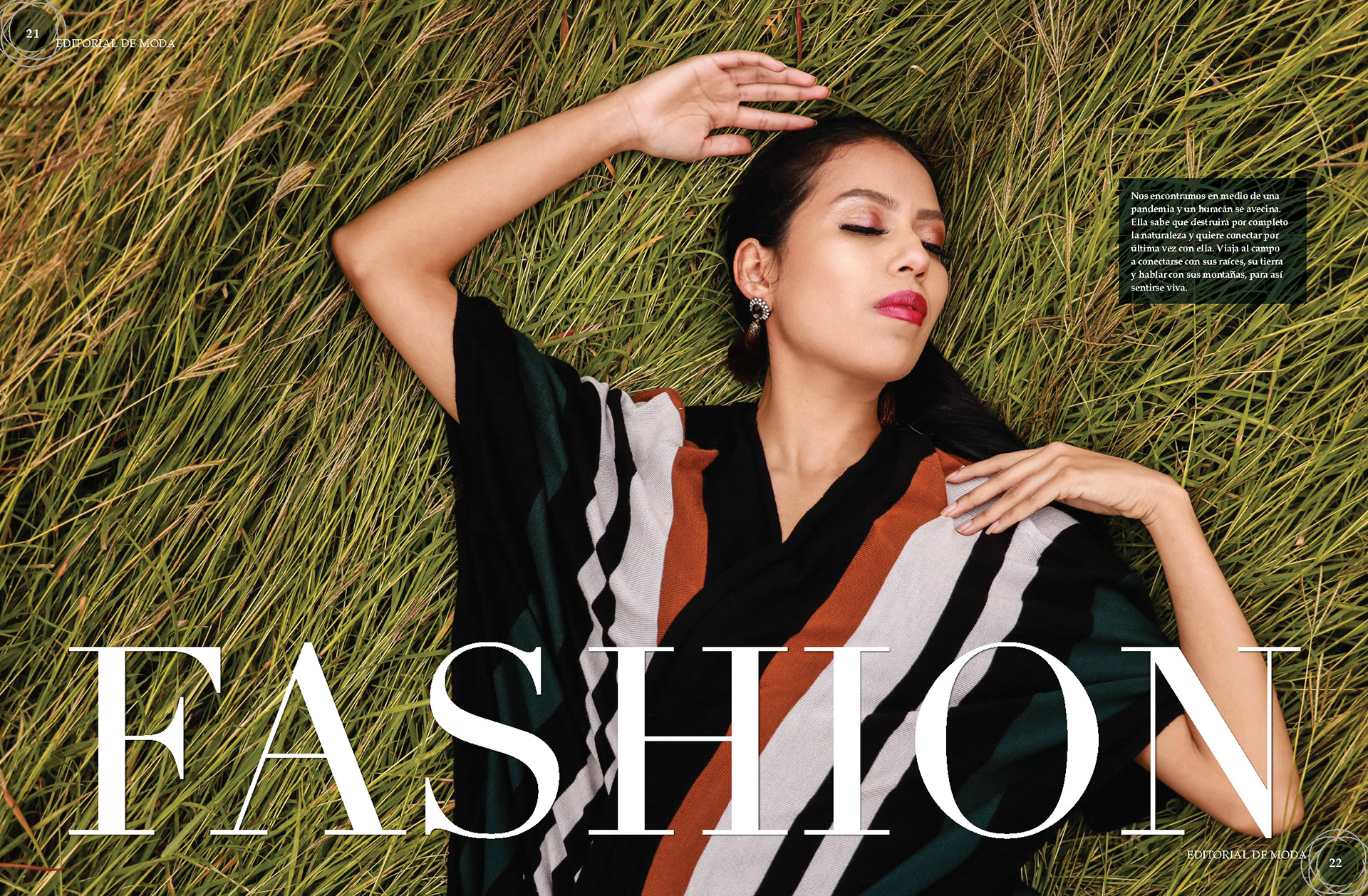
Final Proposal of the first spread of "Fashion"
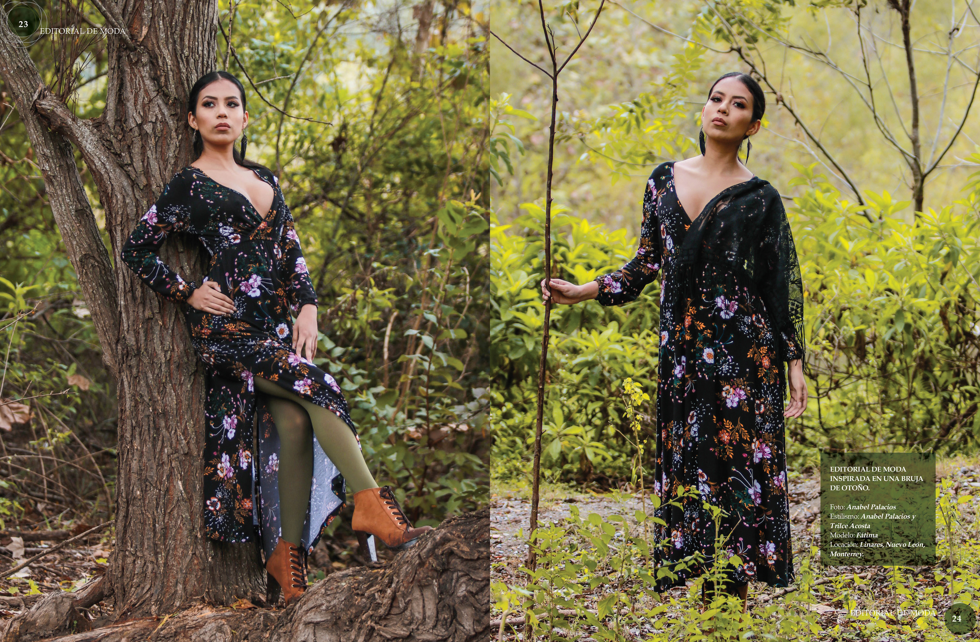
Final Proposal of the second spread of "Fashion"
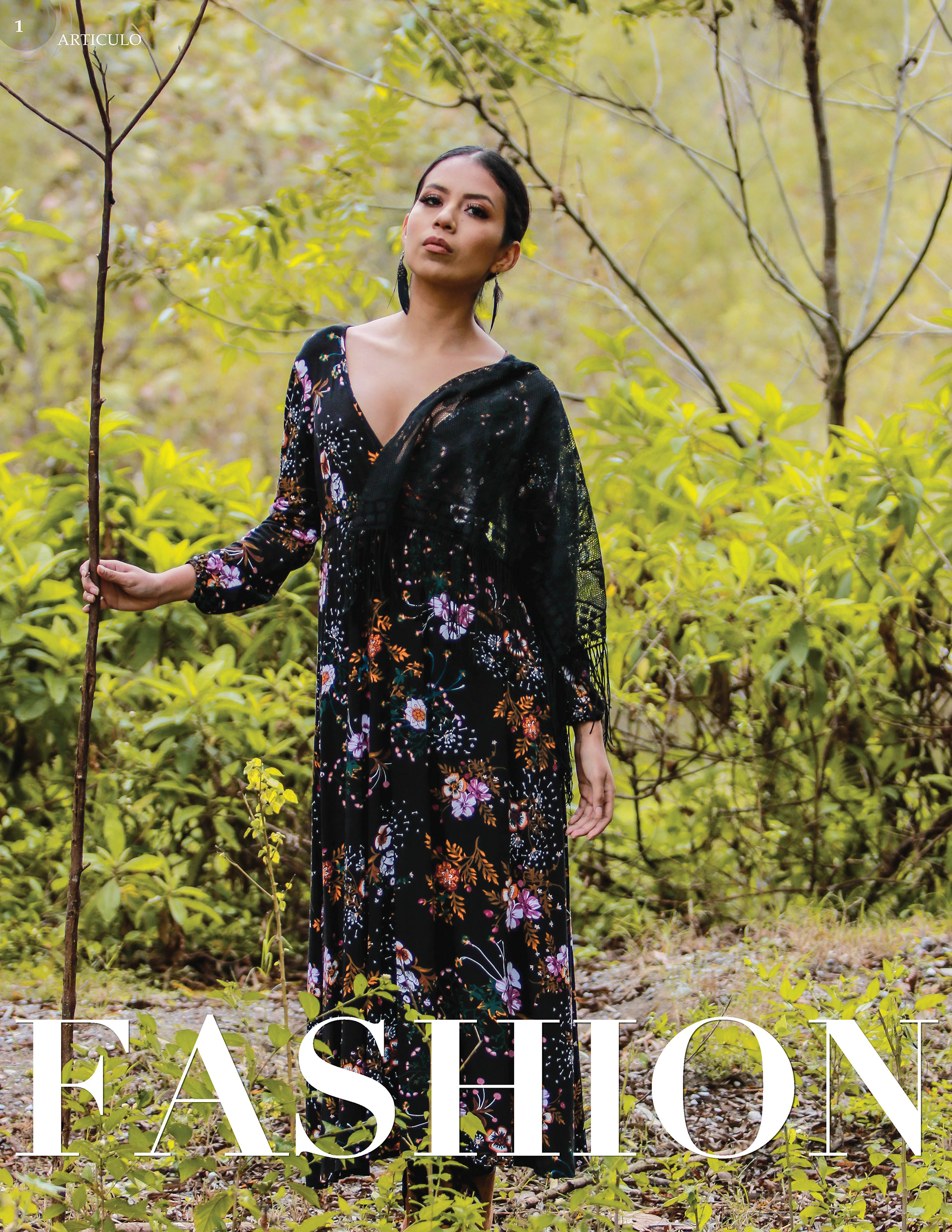
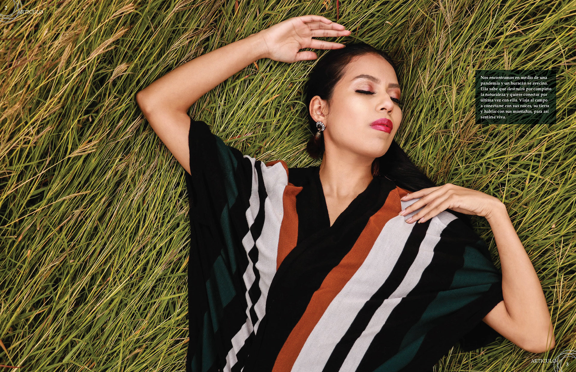
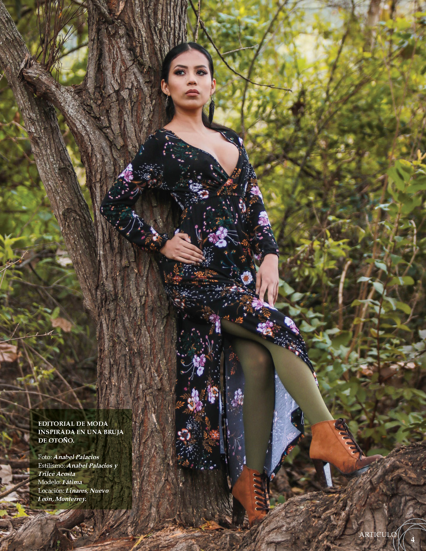
This piece, as Larva clothing aims to showcase a synergy between the style of the dresses and nature. However, here, the main component is the pictures. The first proposal uses different photographs than the final proposal to open this piece, but the title was relatively small.
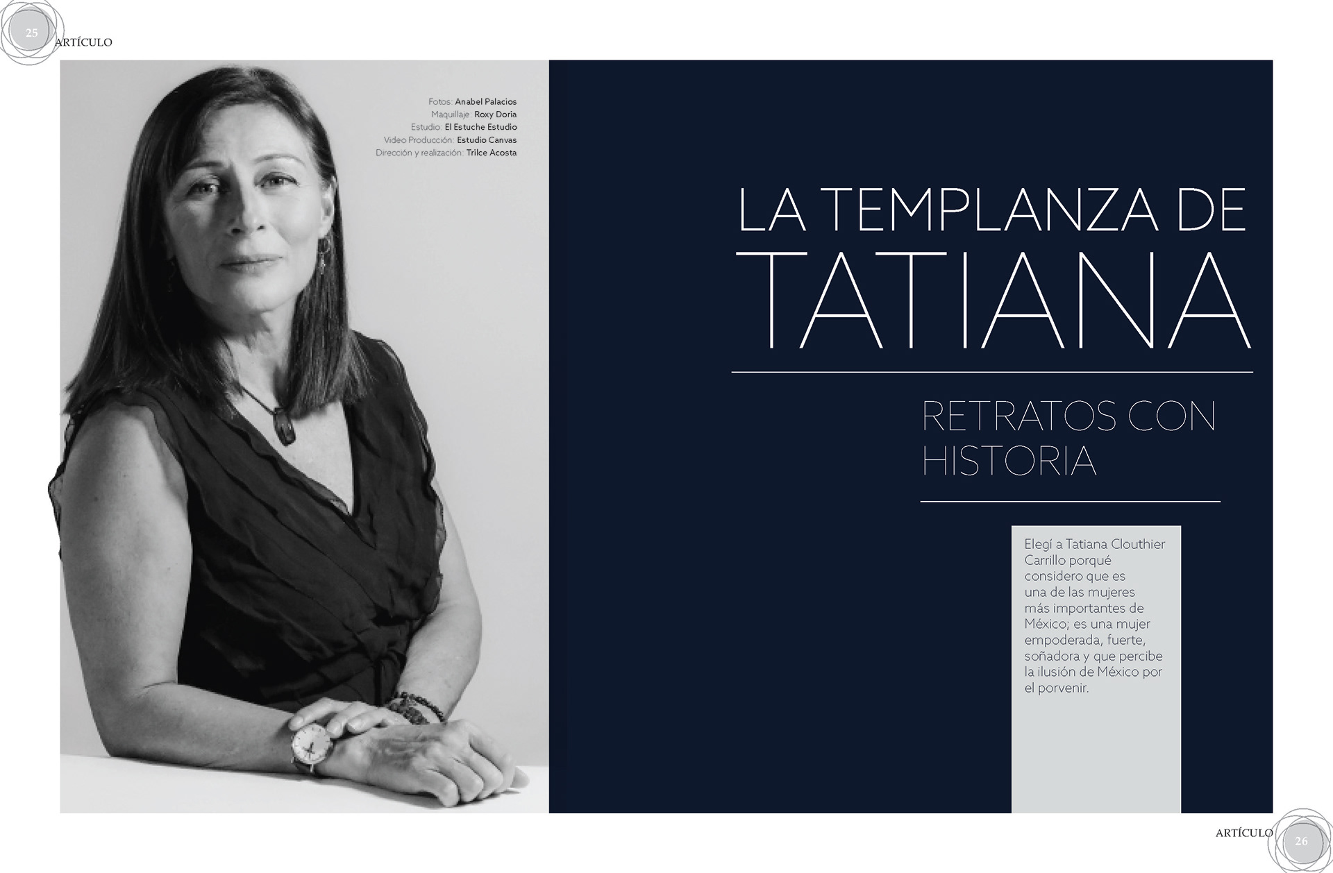
Final Proposal of the first spread of "La Templanza de Tatiana"

Final Proposal of the second spread of "La Templanza de Tatiana"
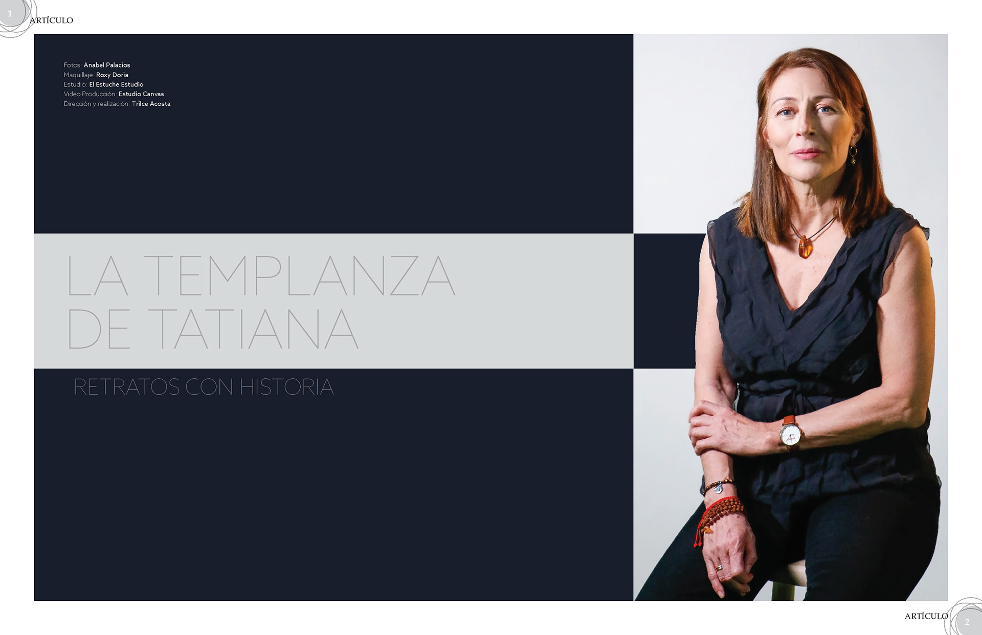
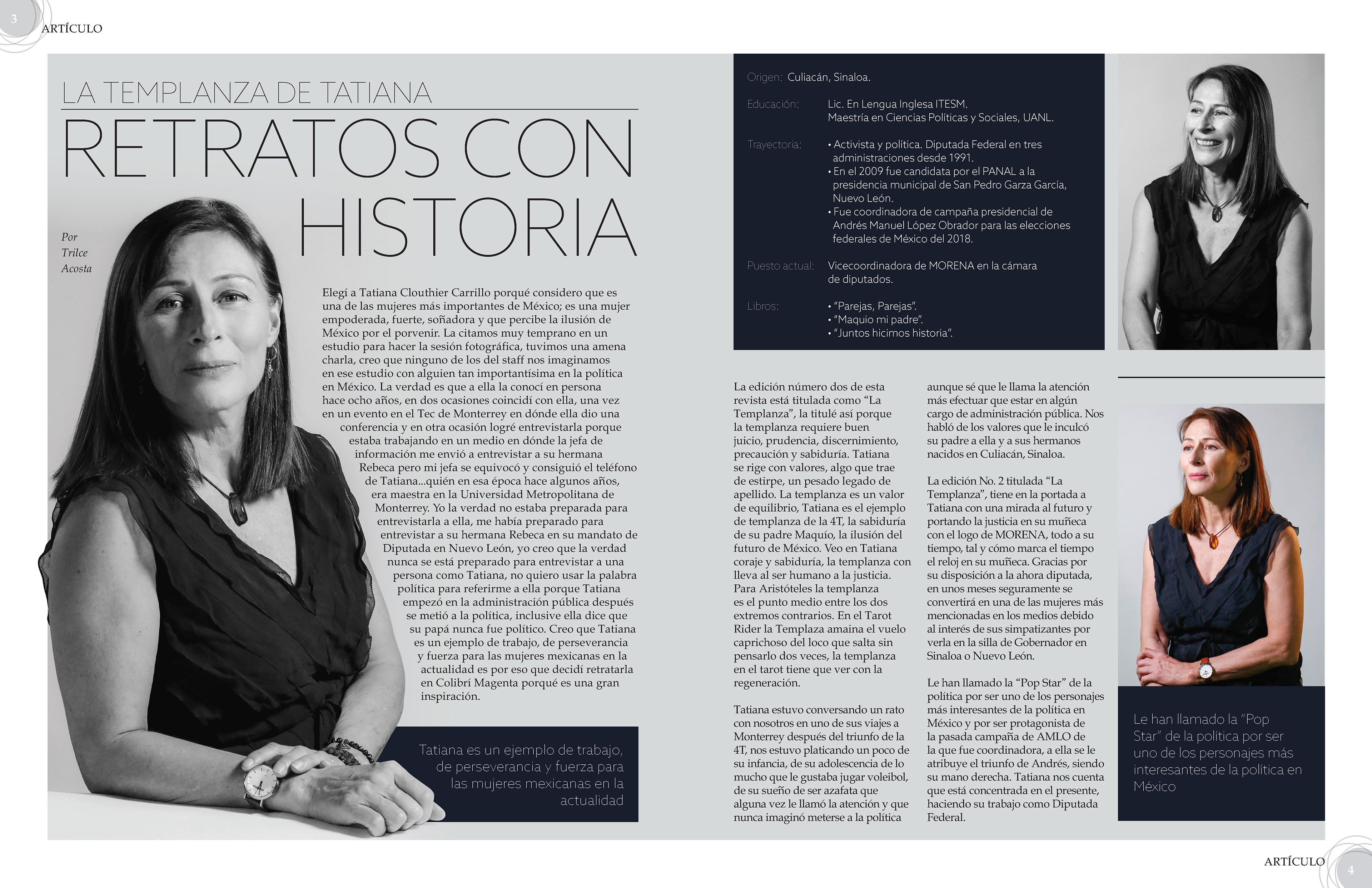
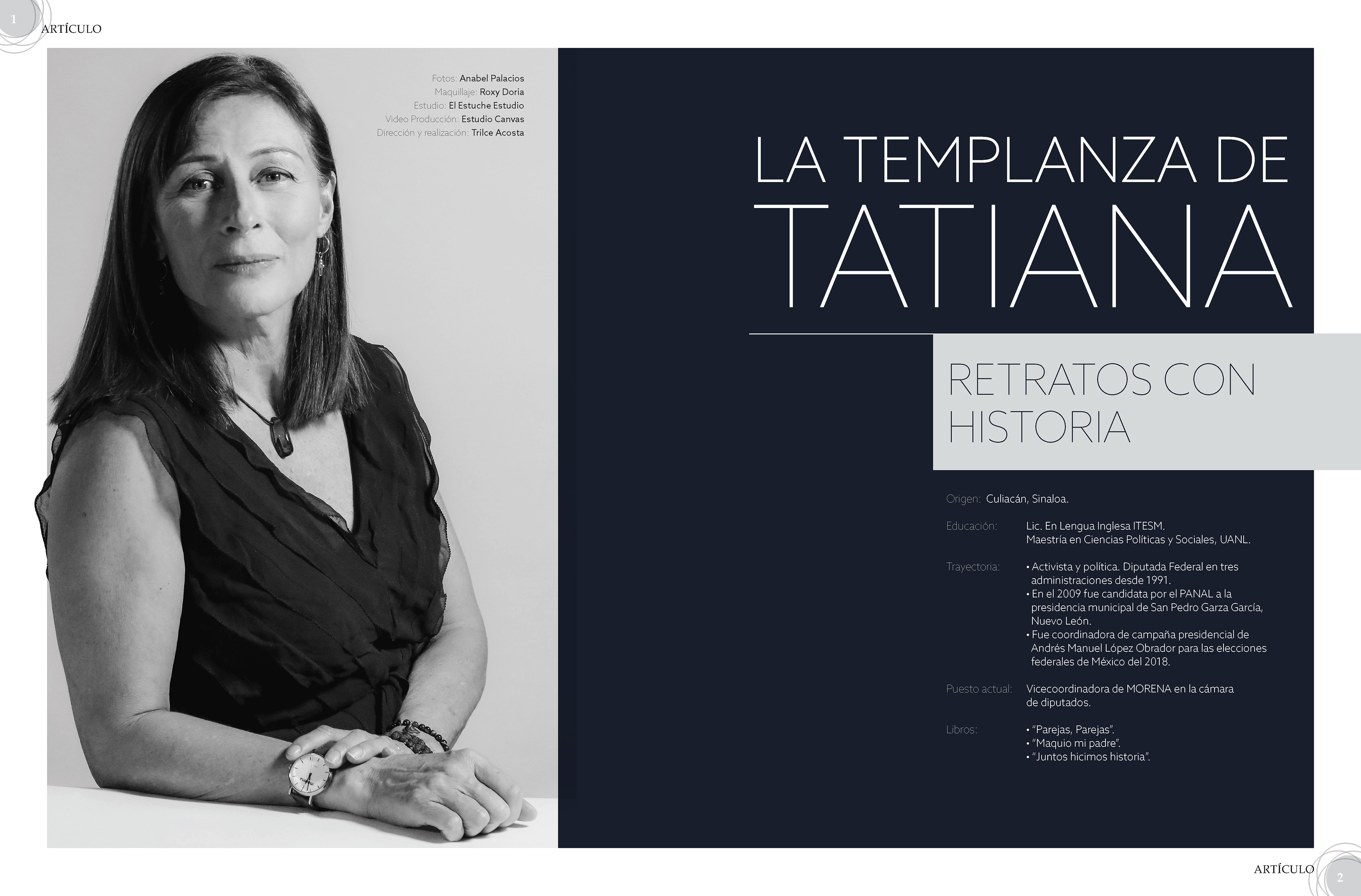

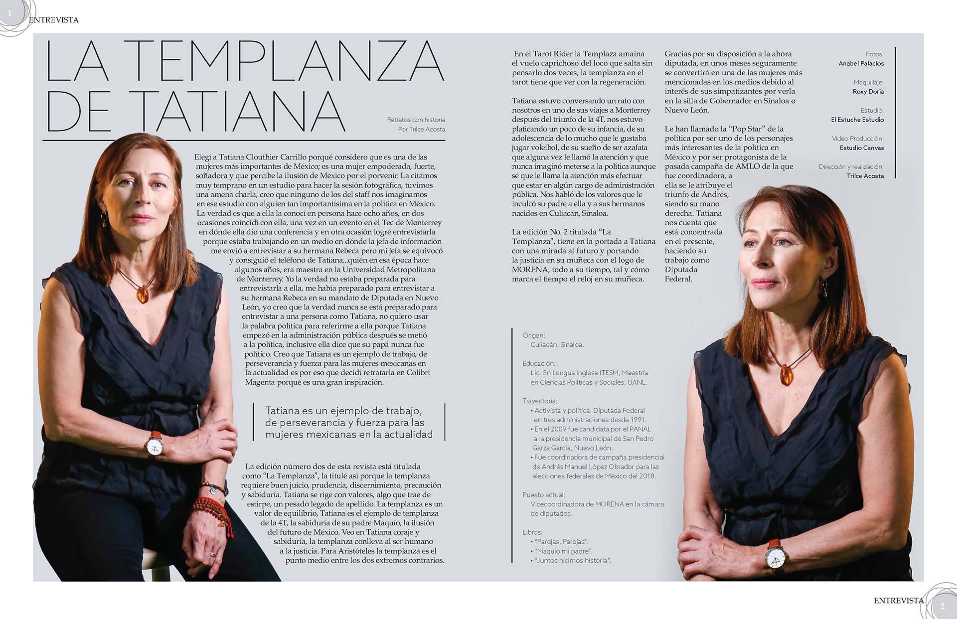
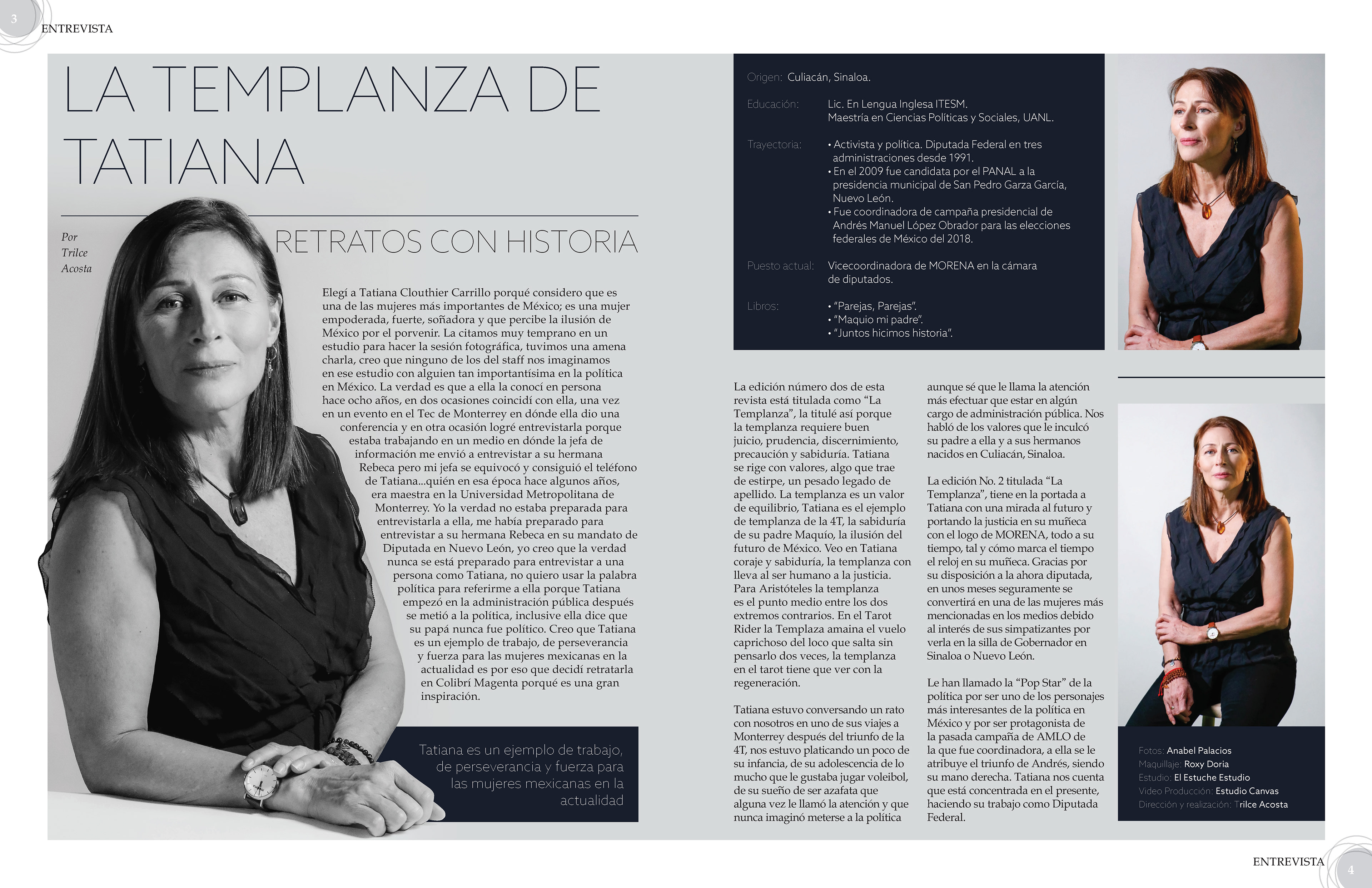
There is a variety of proposals for this article as well. The colour pallet is the same in all of them. The headline was essential to define the article's design; therefore, Bule and a grey with a small percentage of cyan were perfect for reflecting the article's sobriety.
This article was first proposed as a single spread, but it was worth to highlight the essential points of Tatiana and create an extra spread as an introduction to the content.
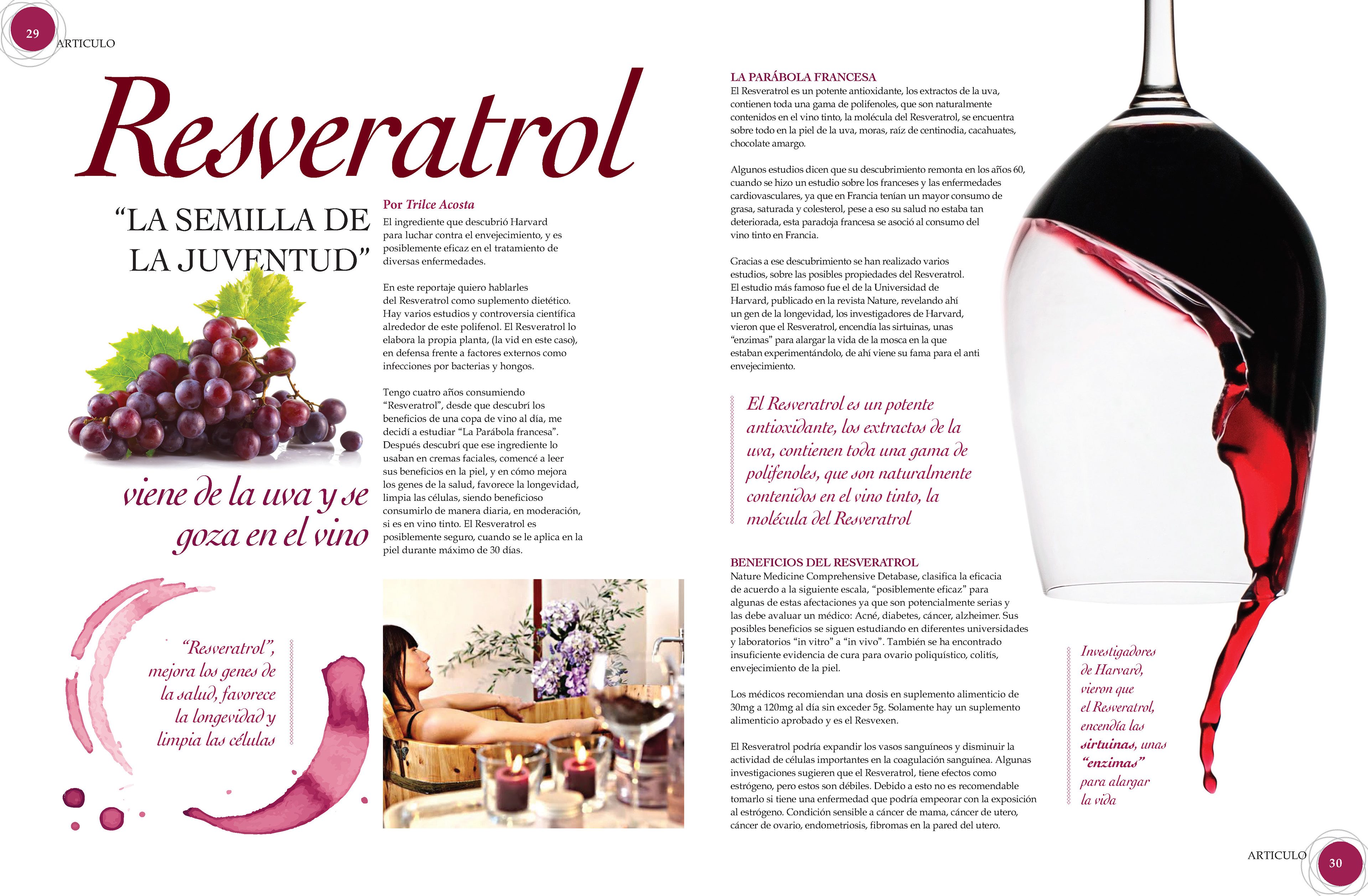
Final and only Proposal of the first spread : "Resveratrol"
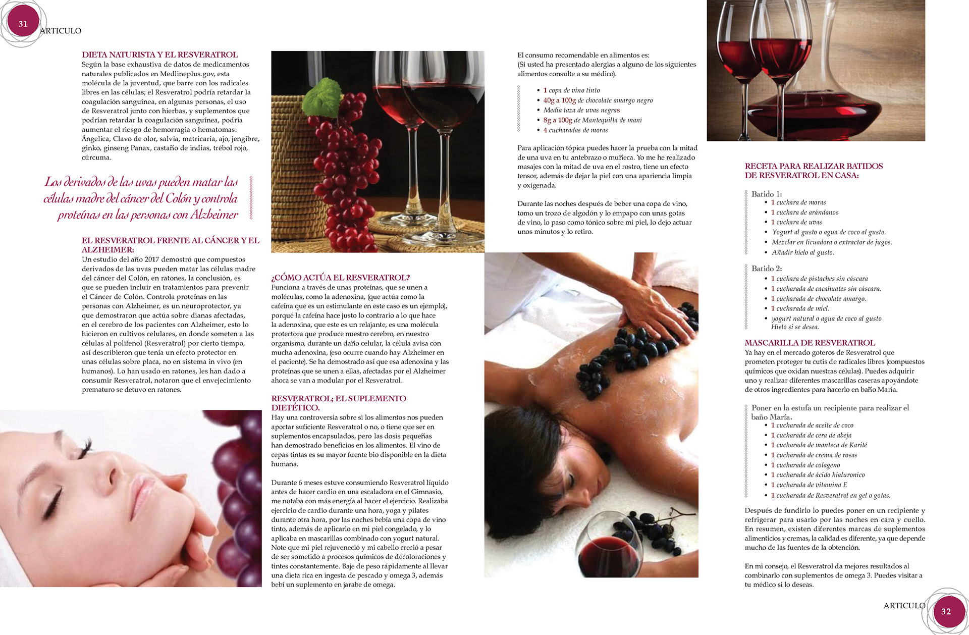
Final and only Proposal of the Second spread : "Resveratrol"
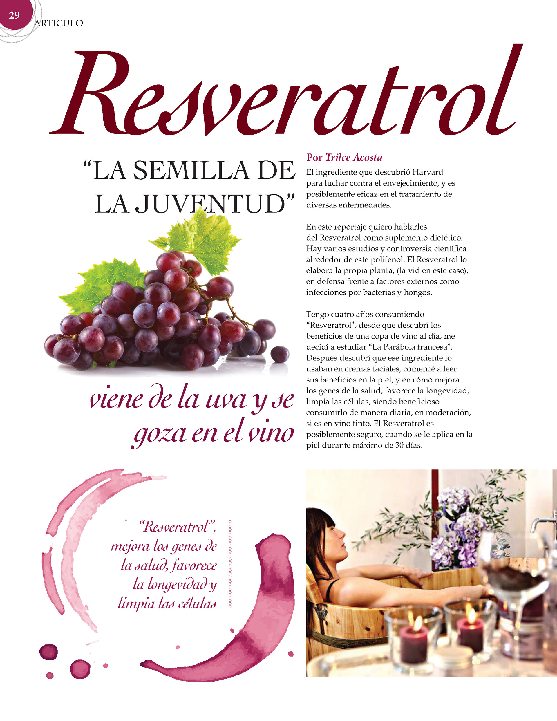
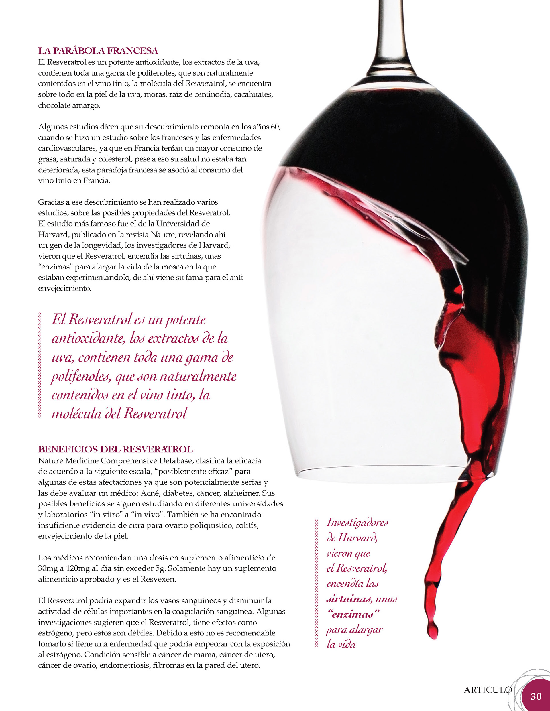
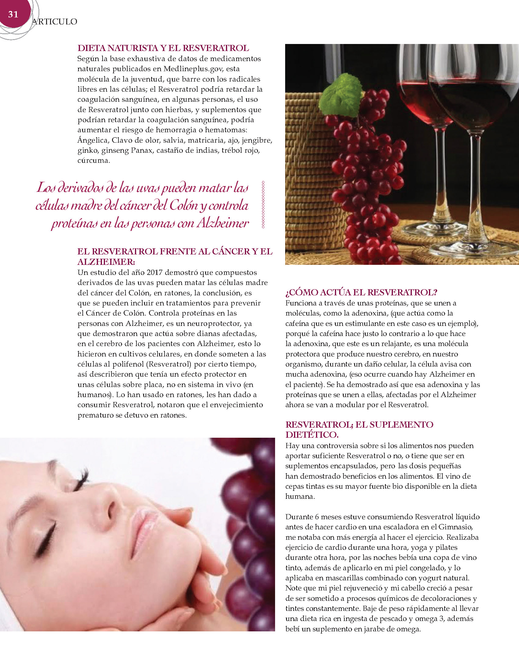
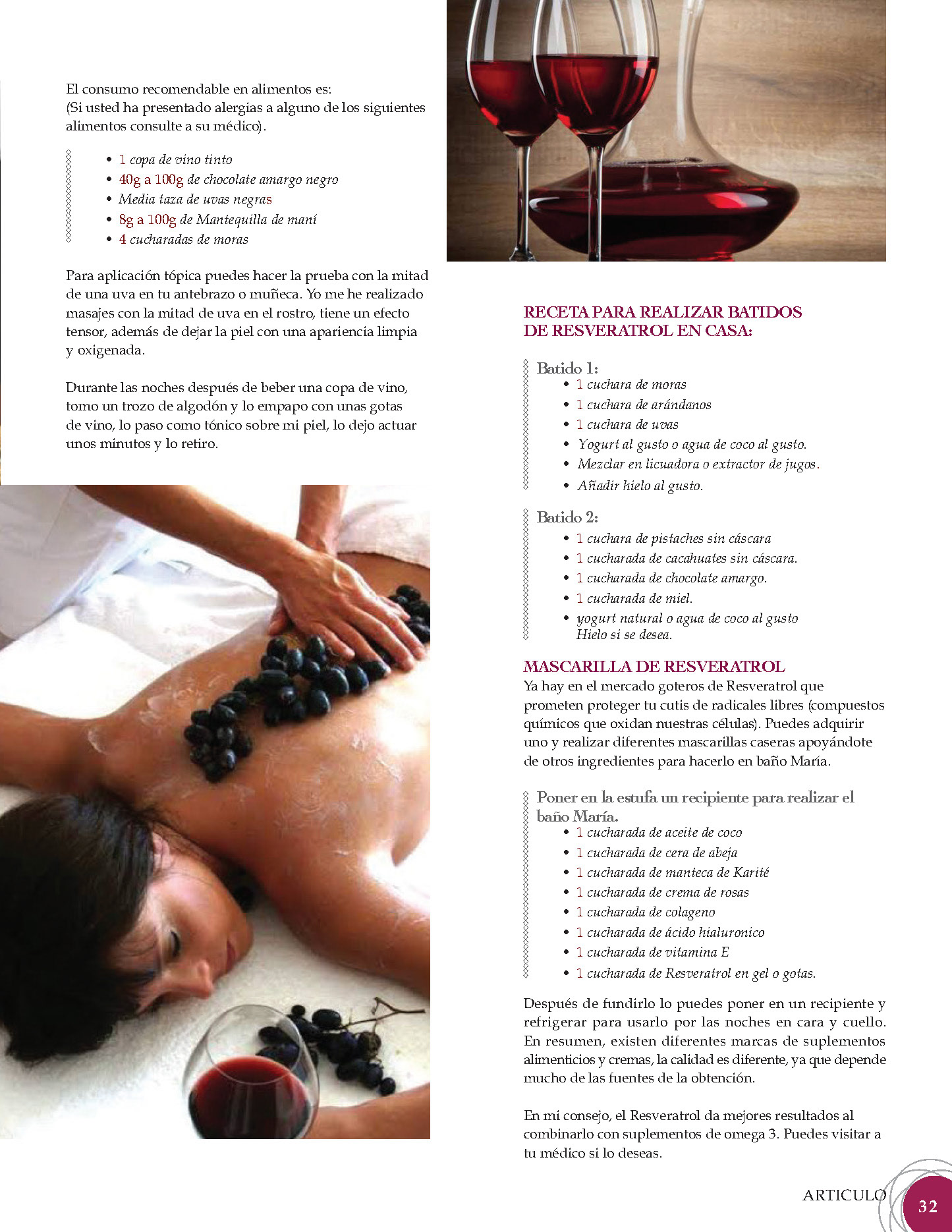
There are no other design proposals for this article. The design was clearly defined from the beginning of planning. The palette colour was determined by extracting tones from a grapes photograph and the image of the cope of wine work as an eye candy that invites the reader to get interested on the content and rest the eye to follow the reading.
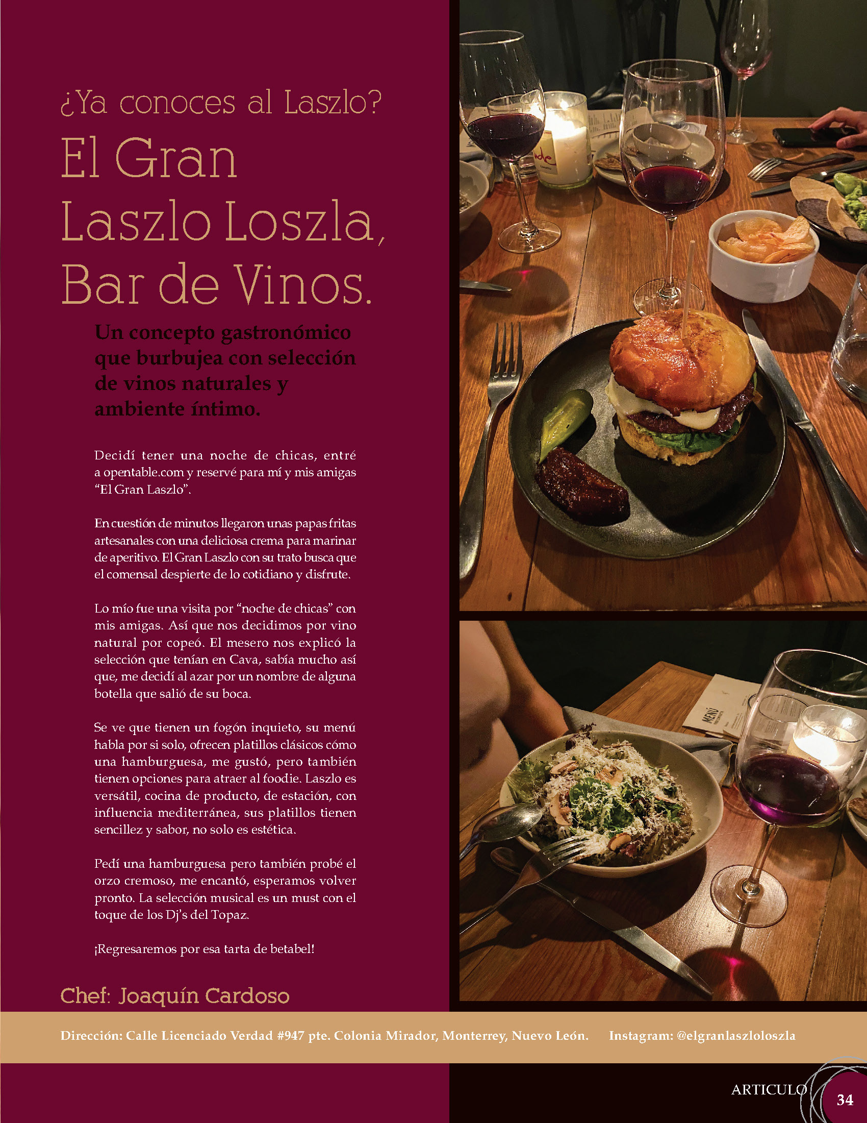
Final and only Proposal of : "El Gran Laslo Loszola"
The tones of colours for this article were also extracted from the photographs of the restaurant. The layout is rectangular and quite simple and sober.
Final and only Proposal of : "Follow Control"

For the design of Follow control, there were two proposals, in which the importance of the article was to highlight the photographs of the event's guests.
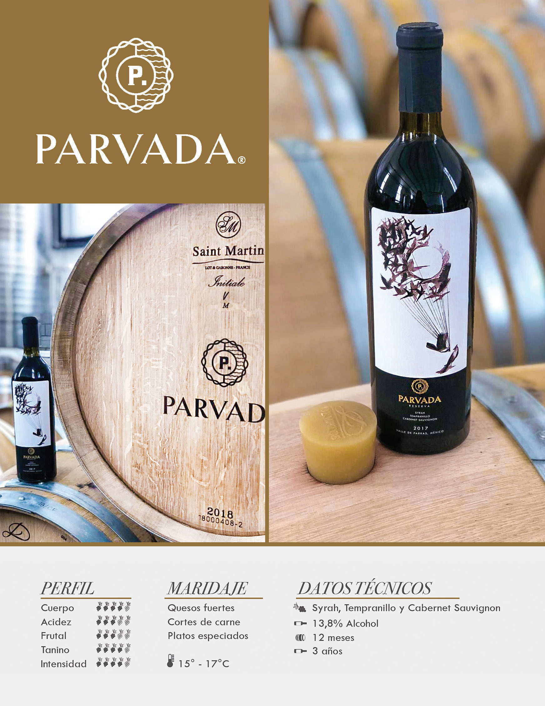
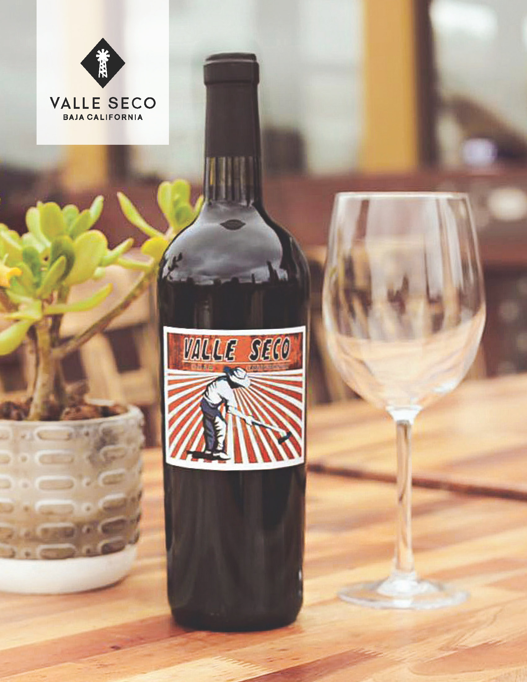
Most of the magazine's advertising promotes brands of wine. Although there are no more than one proposal for each ad, its design was carefully designed to promote the brand and product.
The Back cover has the logo of Follow Control as it is one of the principal collaborators of the magazine.