Noorcus Innovation is based in Mexico City; therefore, all the content within the service catalogue and identity manual is Spanish. However, This is the English explanation of the project's main characteristics. To see the full content in Spanish click in any of the buttons below.
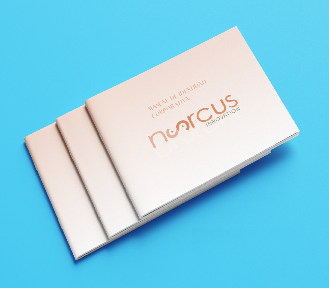
Identity Manual:
The purpose of this manual is to define and disseminate the criteria for applying NOORCUS's institutional image. It is necessary to strictly comply with this manual's specifications to achieve harmony and homogeneity in the designs.
The manual covers:
- Geometry, construction and correct application of the Logo.
- The proper combination of typographies.
- The identity styles applied to marketing products such as folders, cd cases, PowerPoint presentations, postcards, etc.
-Noorcus' colour pallet and variations.
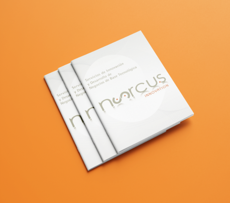
Catalogue Service
The document's purpose is to showcase the primary services that Noorcus offers, based on experience, serve companies and entrepreneurs' needs who recognise Technological Innovation as a critical element to achieve and maintain a competitive position. With the Noorcus model for commercialisation and transmission of technology, the services are organised according to a common purpose.
The design of the document is base on its images because they represent Noorcus common purposes. Therefore, each page's background tends to be white and clean, or the image will fill the hole page and serve as a background integrated with the content.
- The horizontal base layout is six columns with the common use of three columns.
- The vertical layout follows a baseline grid of 12pt.
- The colours and typography have been chosen following the identity manual.
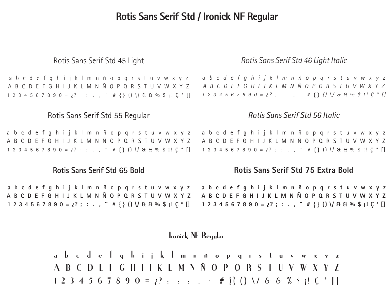
TYPOGRAPHY
Primary Typeface: Rotis Sans Serif Std
Type: Sans Continued
Design by: Otl Aicher (1988)
Classification: Garalde / Grótesque
Rotis is combined with Serif and Sans leaders' key qualities in a single-family, consisting of readability, functionality, sobriety, and mutability within the design. Rotis is one of the first "super-families" or typeface system, and its basic style comes from Central Europe, Russia and Greece.
Secondary Typeface: Ironick NF Regular
Type: Sans Grótesque
Classification: Garalde / Grótesque
Base Style: Central Europe, Russia and Greece.
Its use is related to titles and ornaments. Ironick, its a variant of Rotis Sans typeface, therefore it shares most of its qualities but not all since. Despite being a sans, the body of this typeface leans more towards the Grótesque classification. Although it shares the same established width, weight, and height, its skeleton's principle provides a difference showing the traditional grotesque.
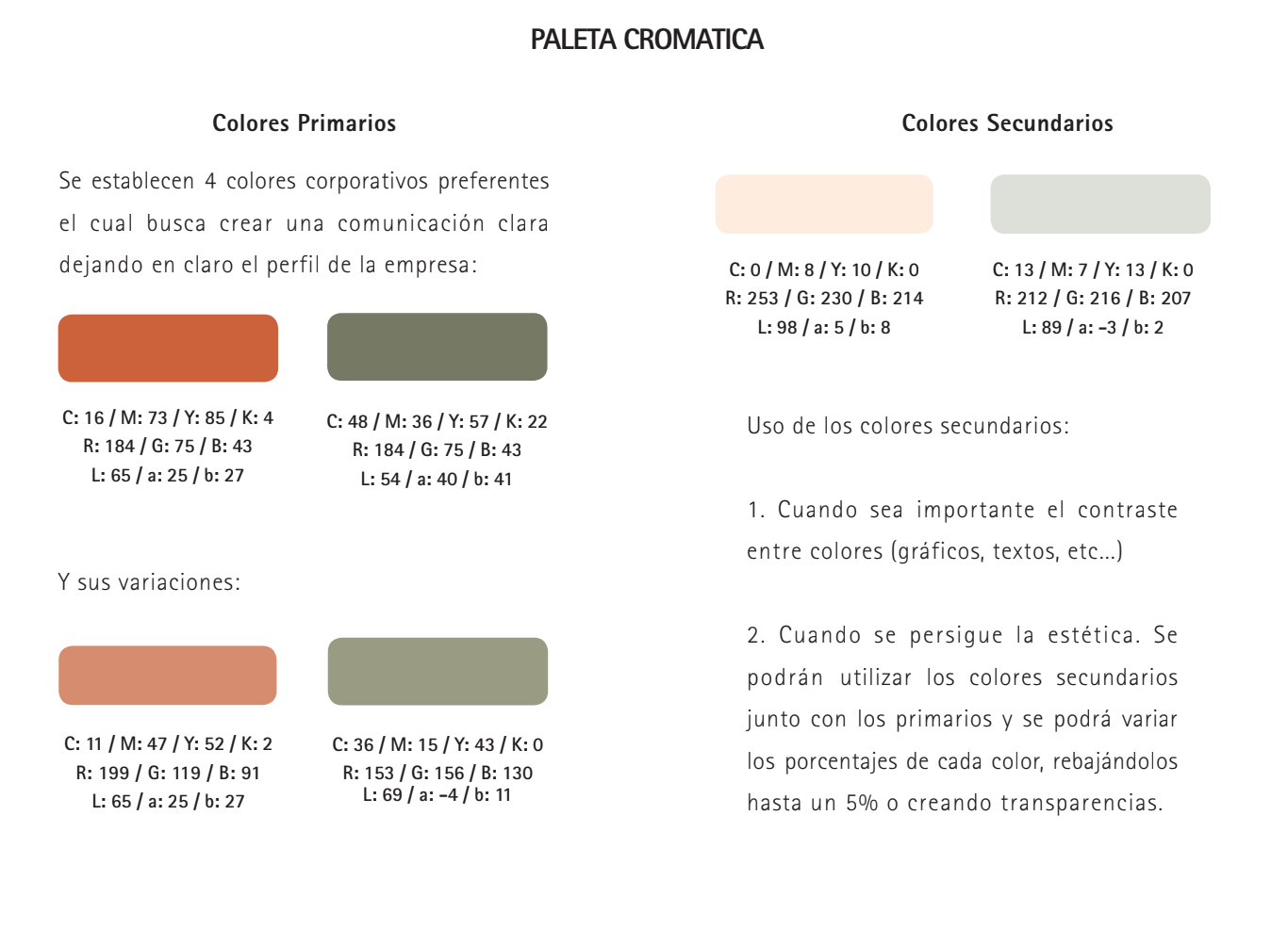
COLOR PALETTE:
Primary colours:
Two corporate colours seek to create clear communication making obvious the companies profile.
Orange #ca623d: Showcase vibrance and confidence
Green #767a65: Showcase growth in the technology industry
Black and grey: Neutral colour.
Two corporate colours seek to create clear communication making obvious the companies profile.
Orange #ca623d: Showcase vibrance and confidence
Green #767a65: Showcase growth in the technology industry
Black and grey: Neutral colour.
Secondary colours:
Variation of the primary colours at a 75%
Variation of the primary colours at a 75%
Secondary colours:
1. When the contrast between colours is significant (graphics, texts, etc.)
2. When aesthetics are pursued.
1. When the contrast between colours is significant (graphics, texts, etc.)
2. When aesthetics are pursued.
The secondary colour pallet combined with the primary colours and each colour's percentages can be varied, reducing them by up to 5% or creating transparencies.
Secondary colours are often used with primary colours. Each colour's percentages can be varied, reducing them by up to 5% or creating transparencies.
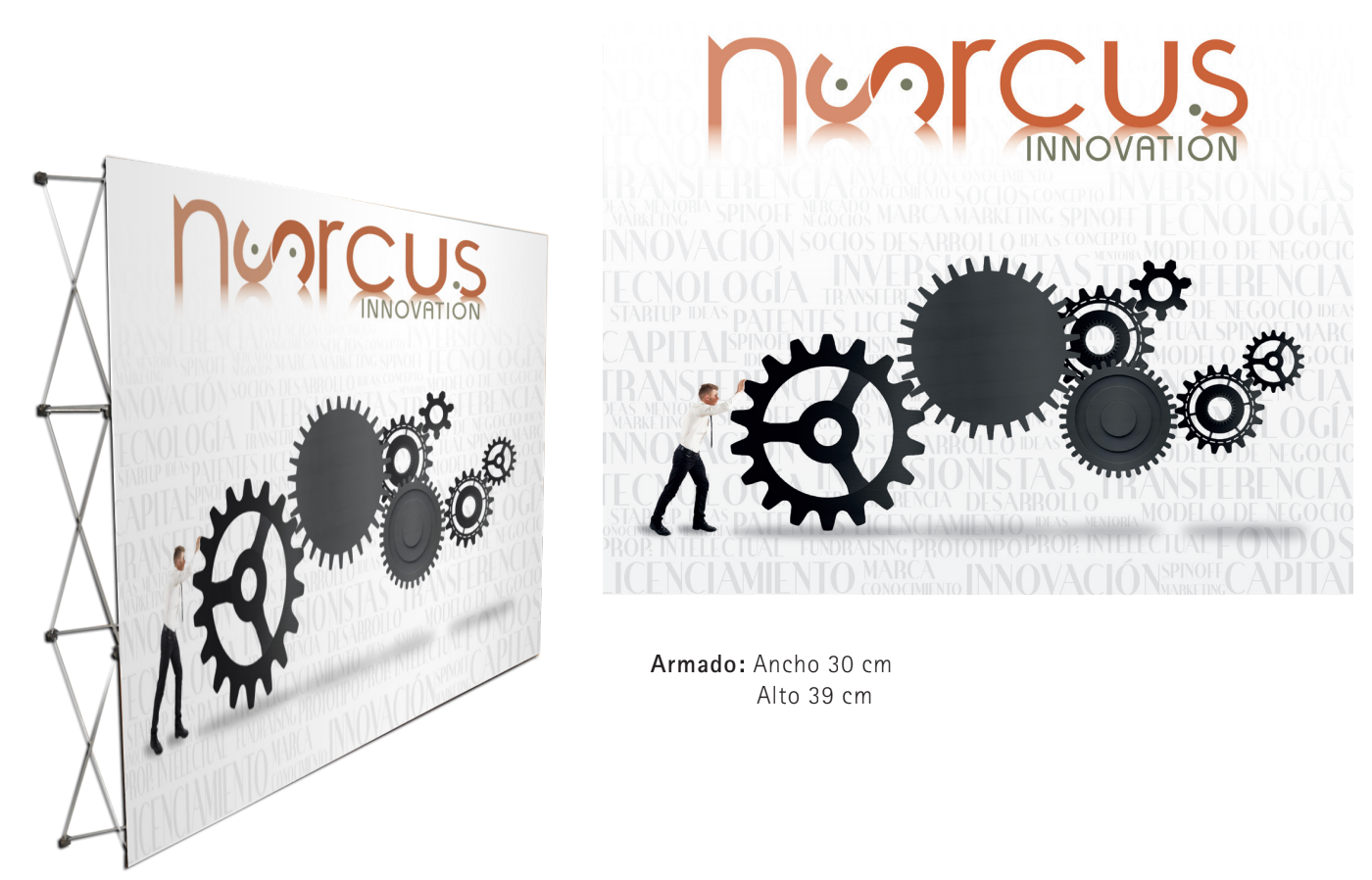
Example of a banner to show use in events.
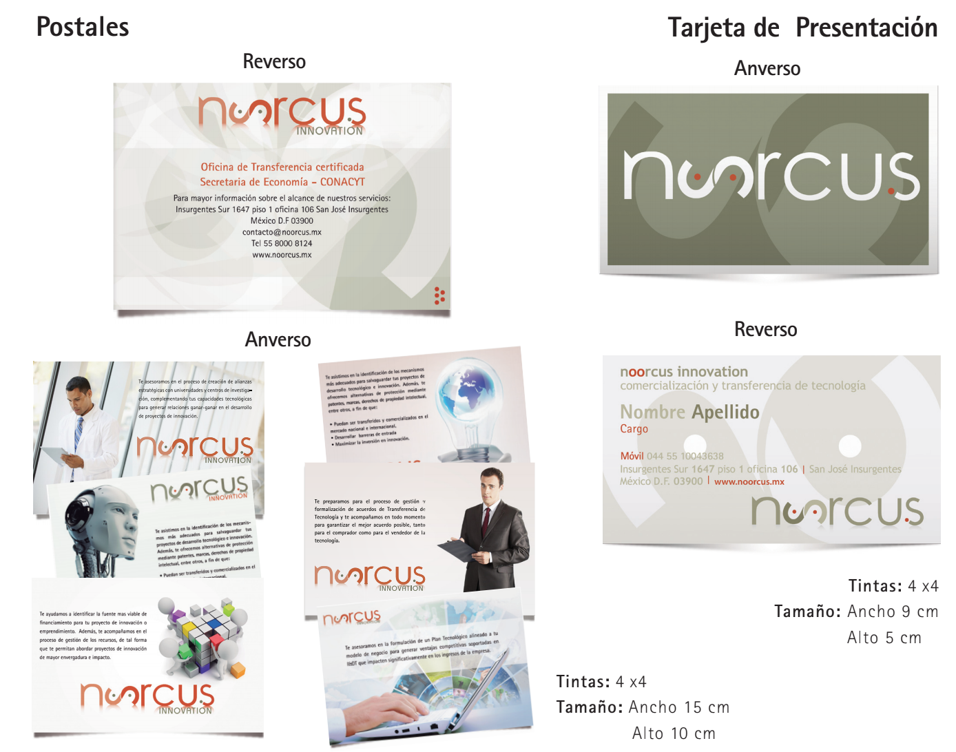
Designs of postales and business card.